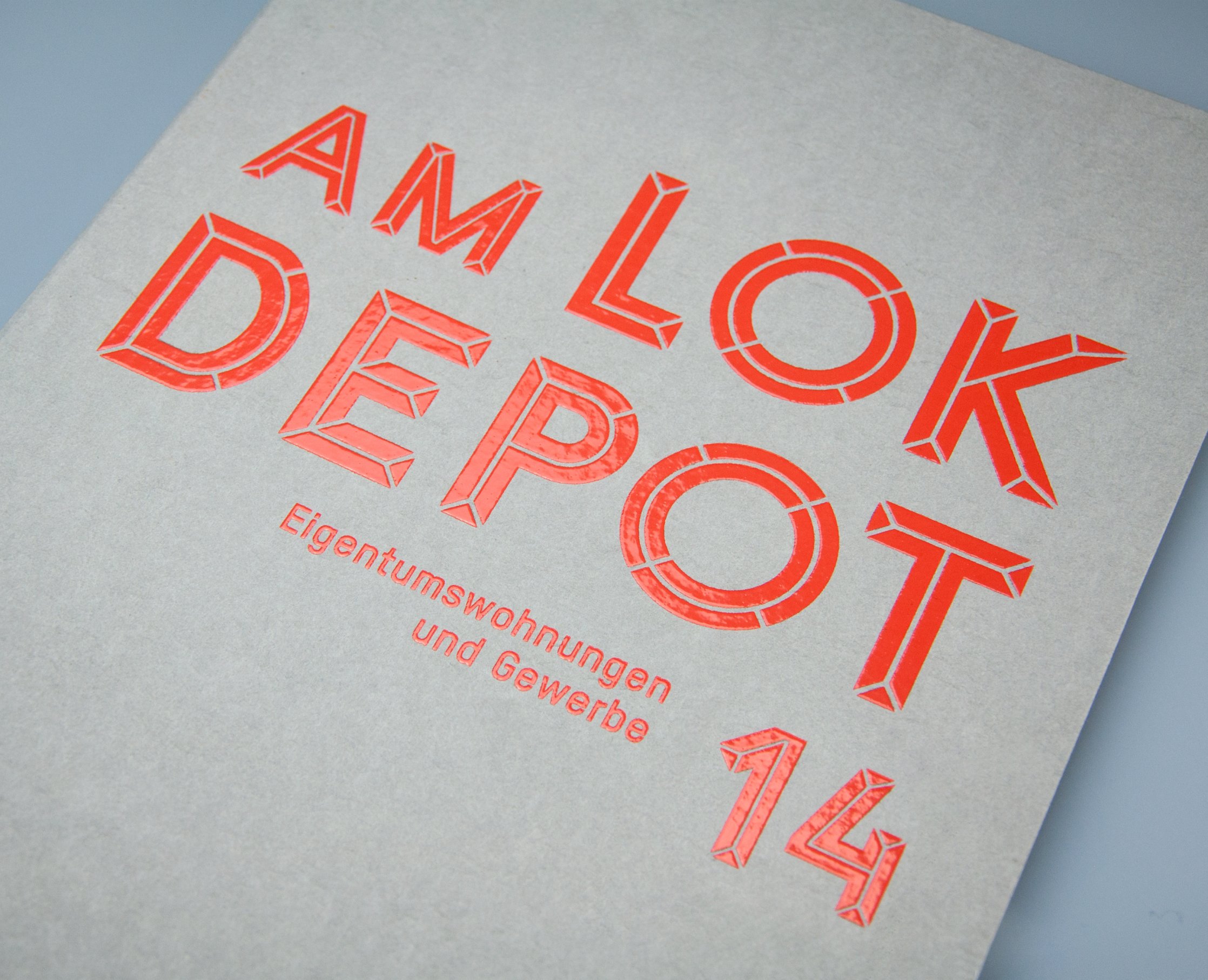
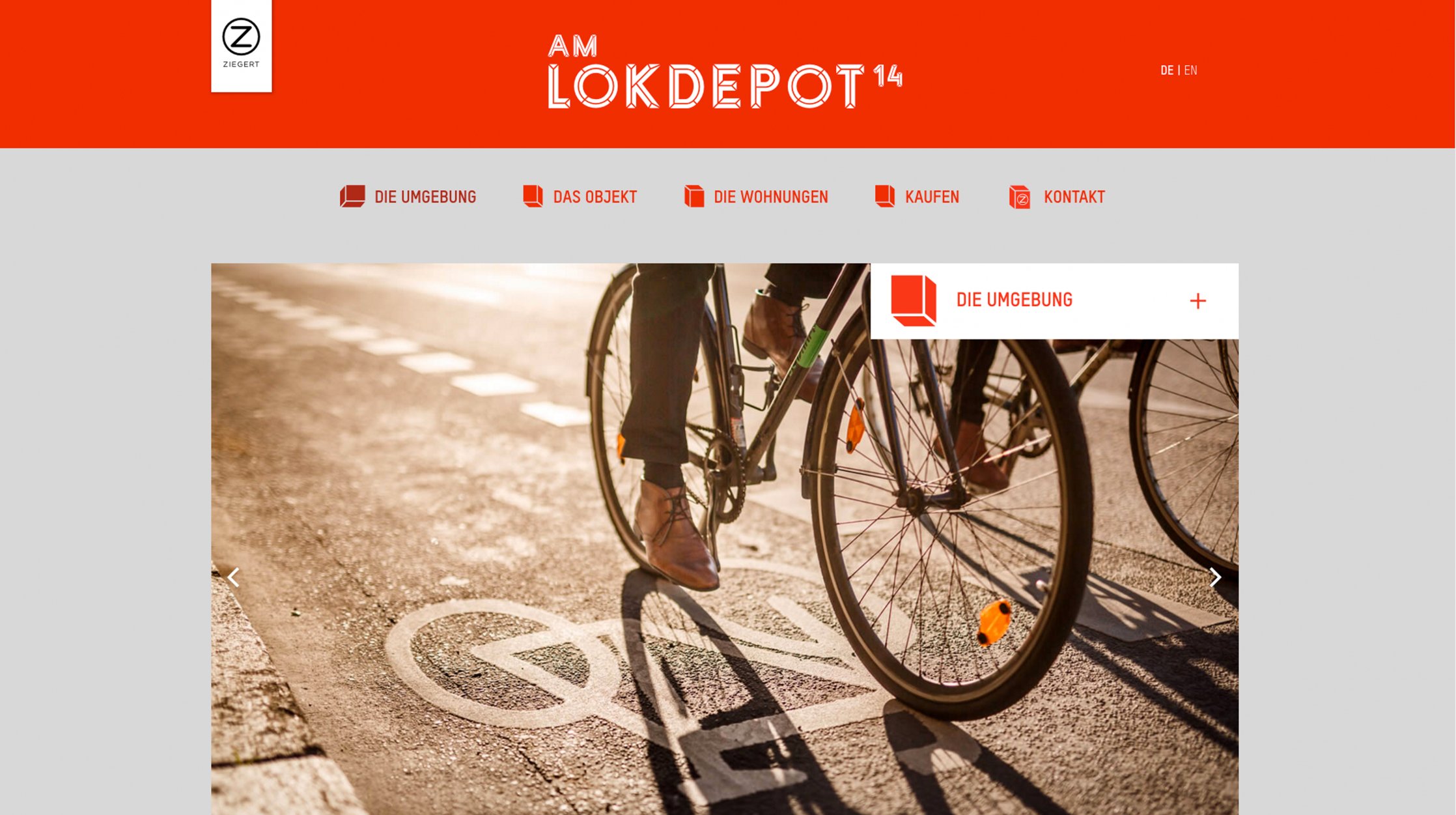
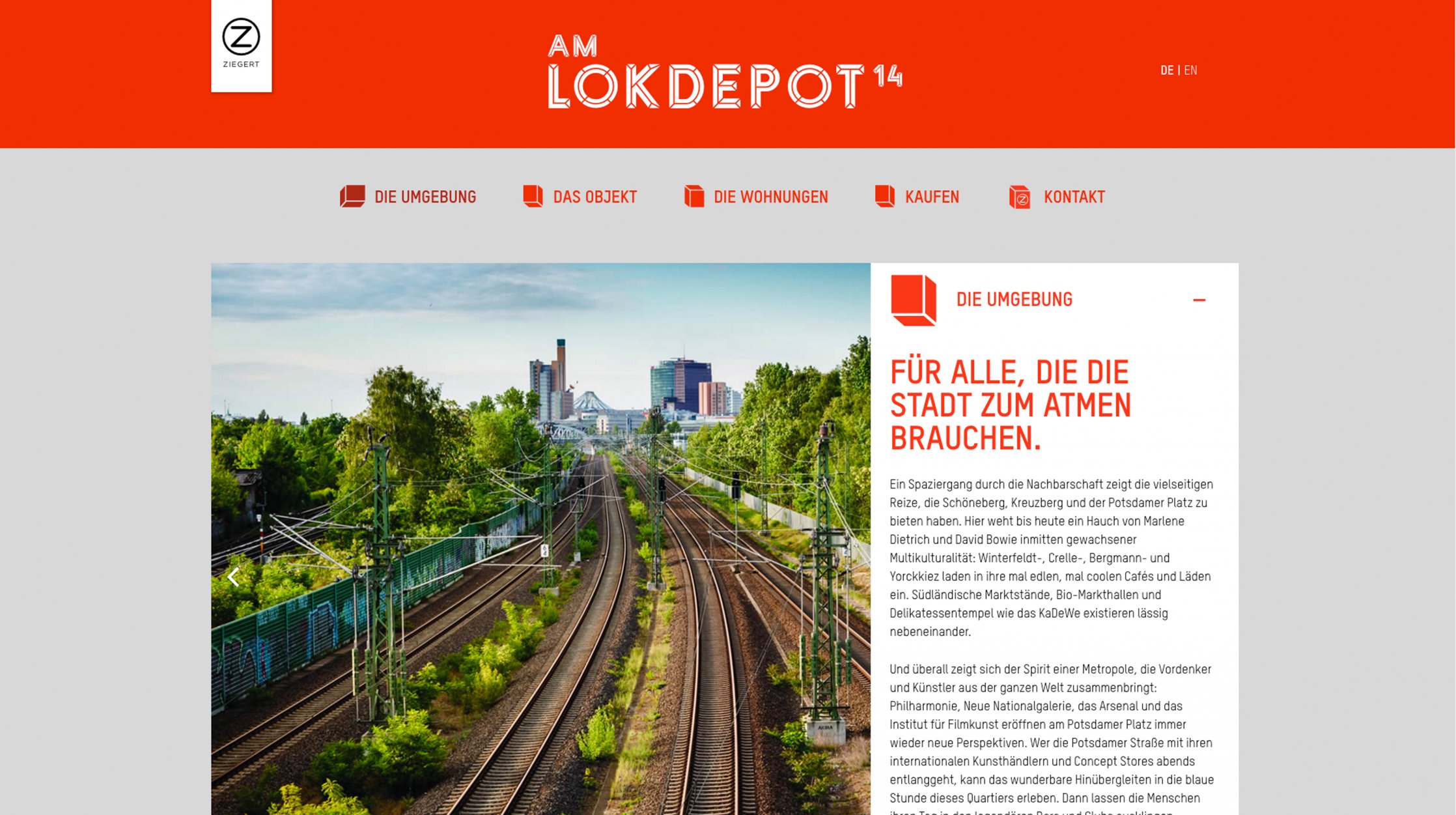
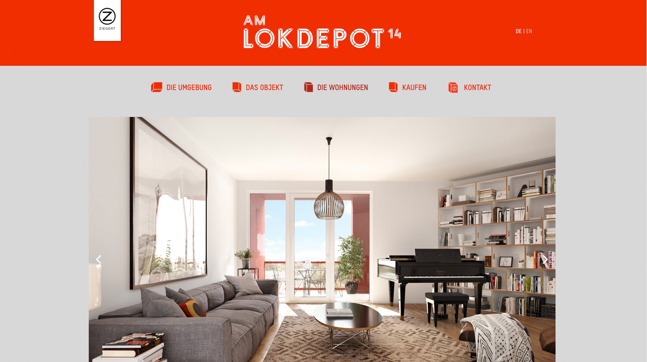
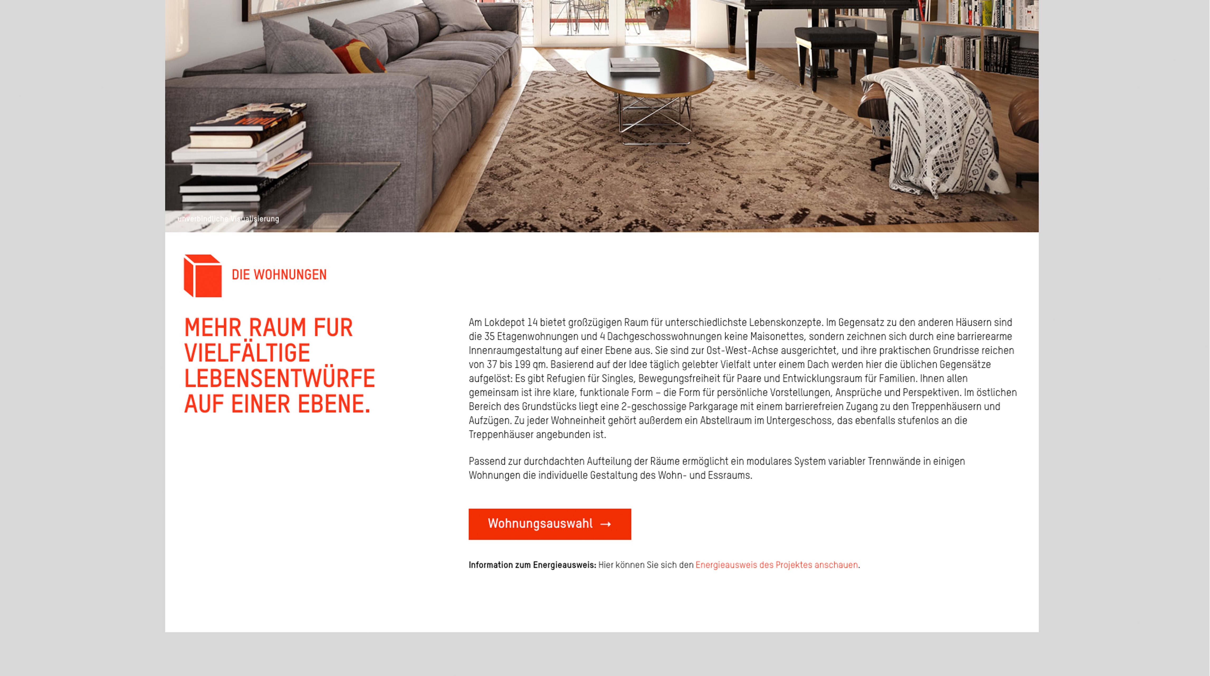
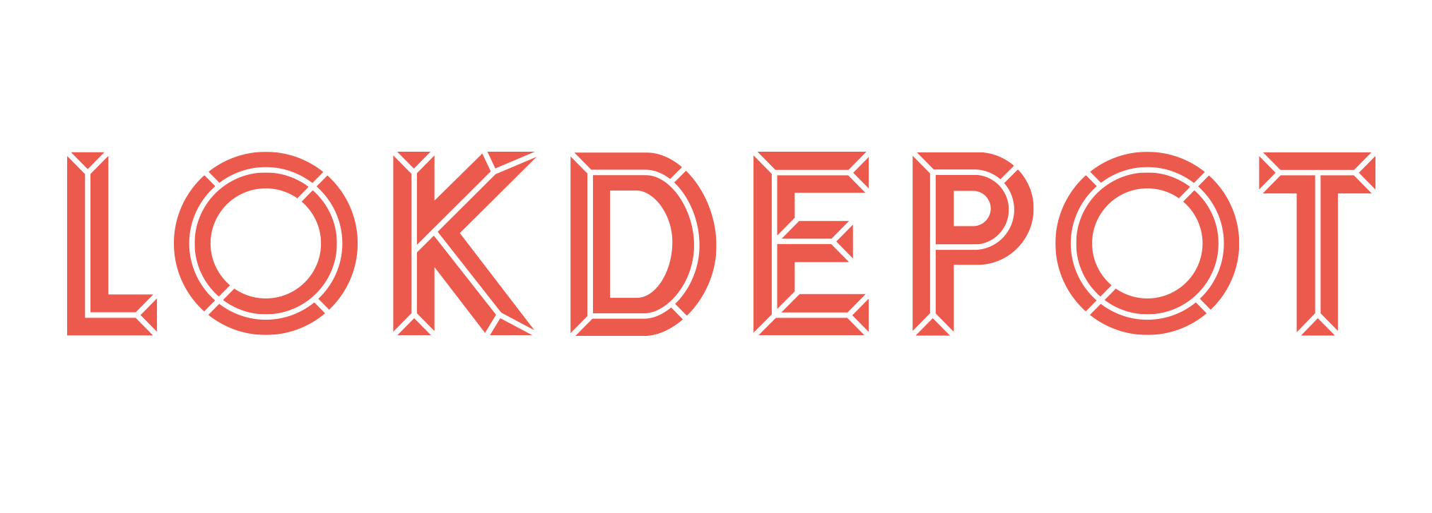
This corporate design was created for the apartments of ›Am Lokdepot‹, which, with their red geometric facades, emanate an architectural combination of rugged charm and modern clarity.
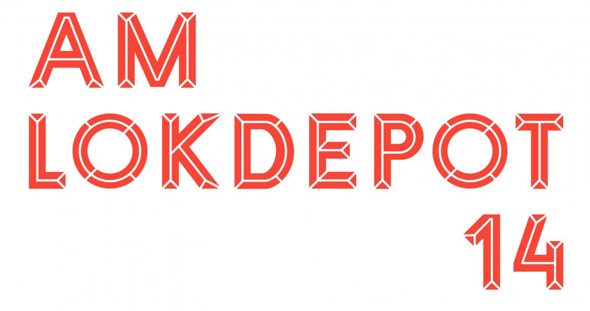
The architectural qualities found within the apartments’ façades are echoed in all of the media touch points developed for the buildings. The specially designed logo plays with the buildings’ post-industrial flair, pairing it with architectural charm.
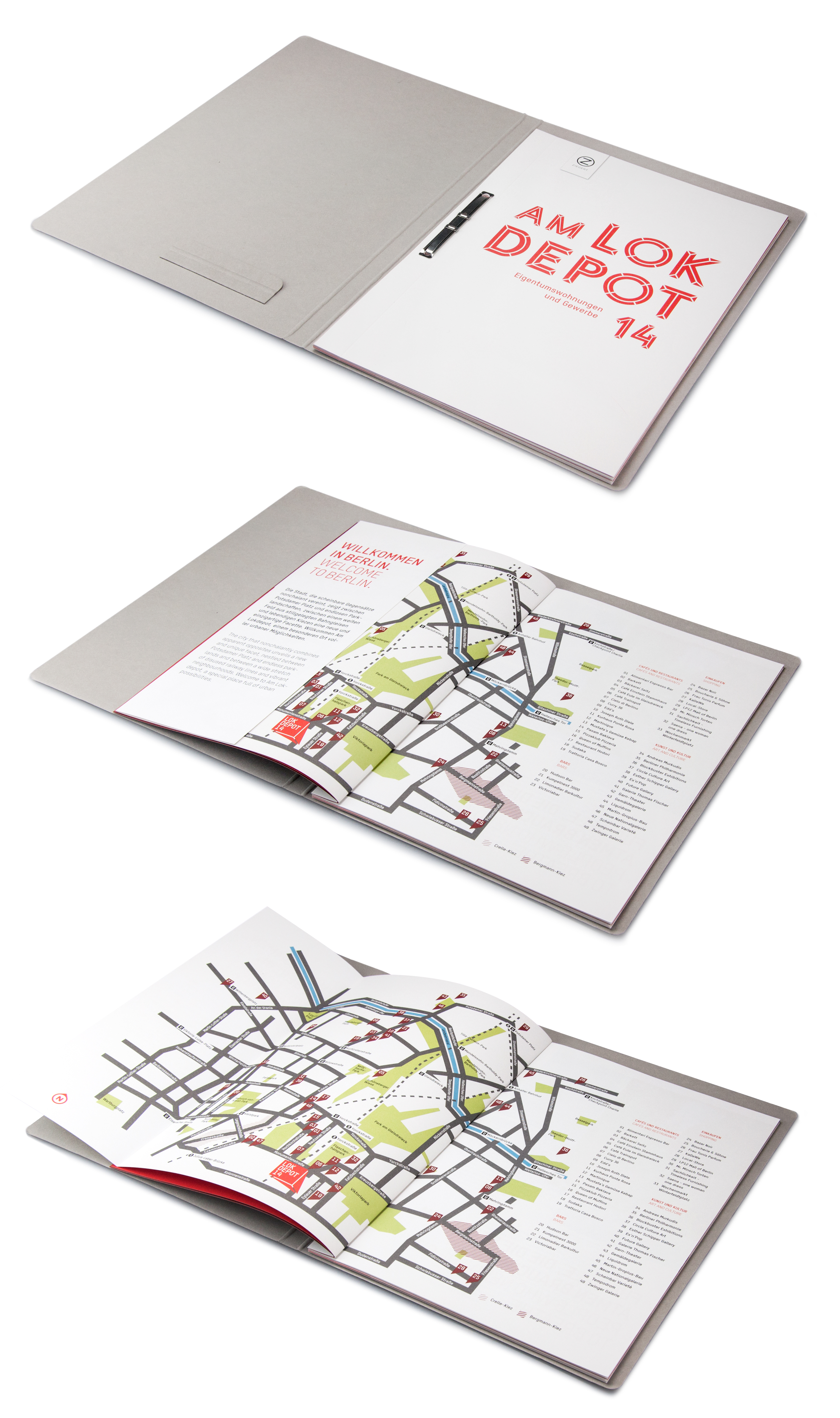
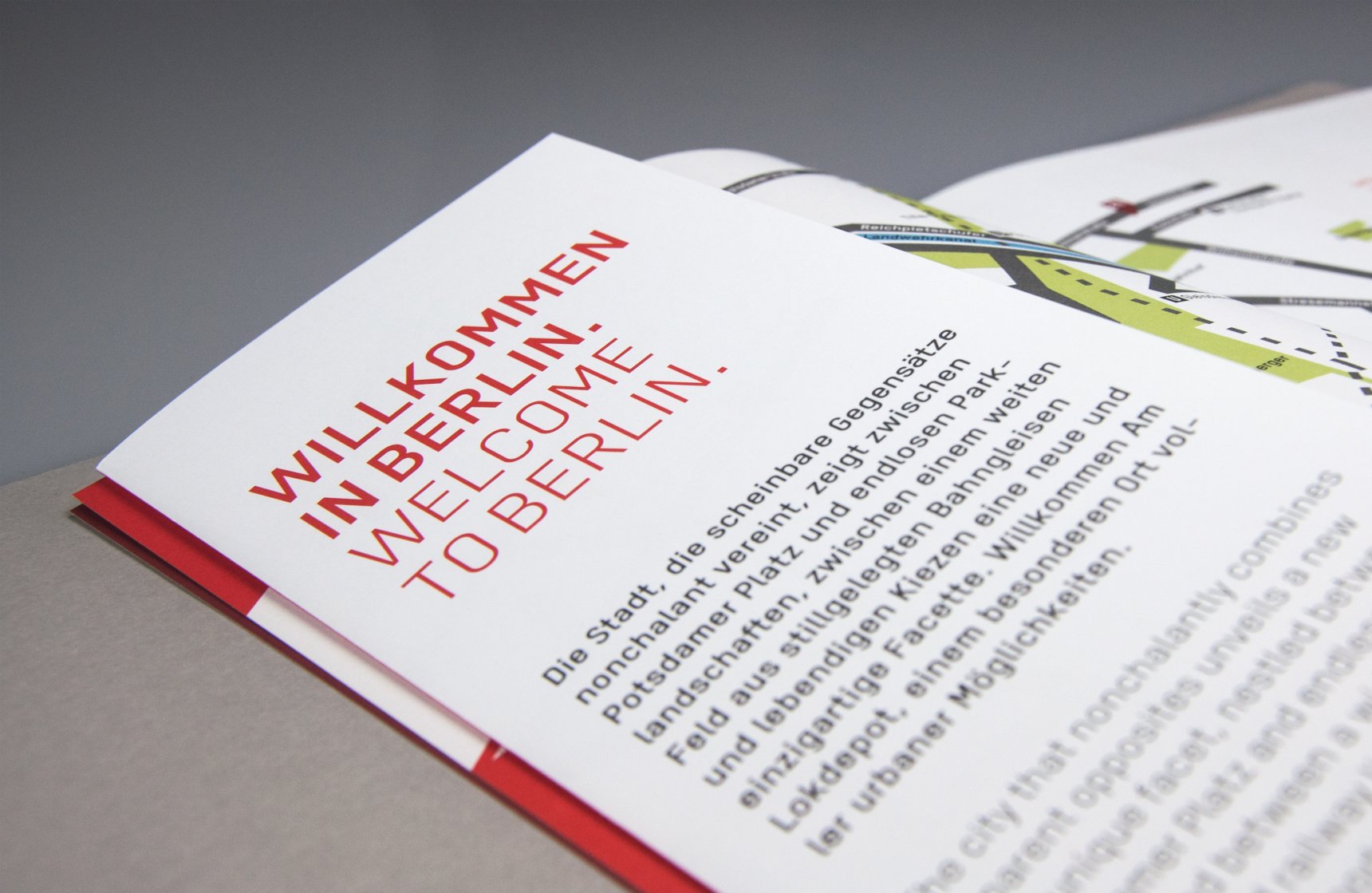
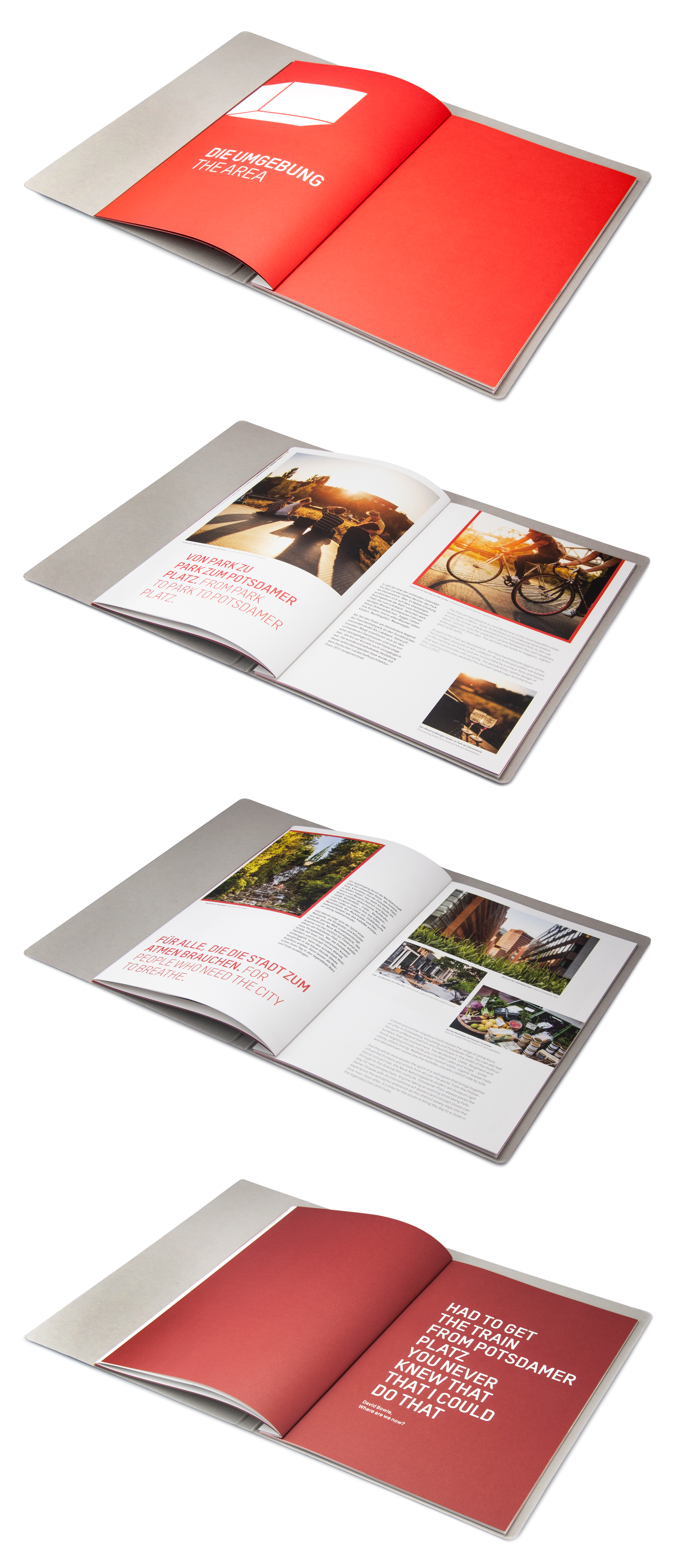
The design of the overarching exposé system is flexible, allowing for the customization of the content in response to specific needs. The cover, which is made out of cardboard, is elevated through the application of a partial UV lacquer. The design mirrors the contrast of the building: a marriage of roughness and brilliance.
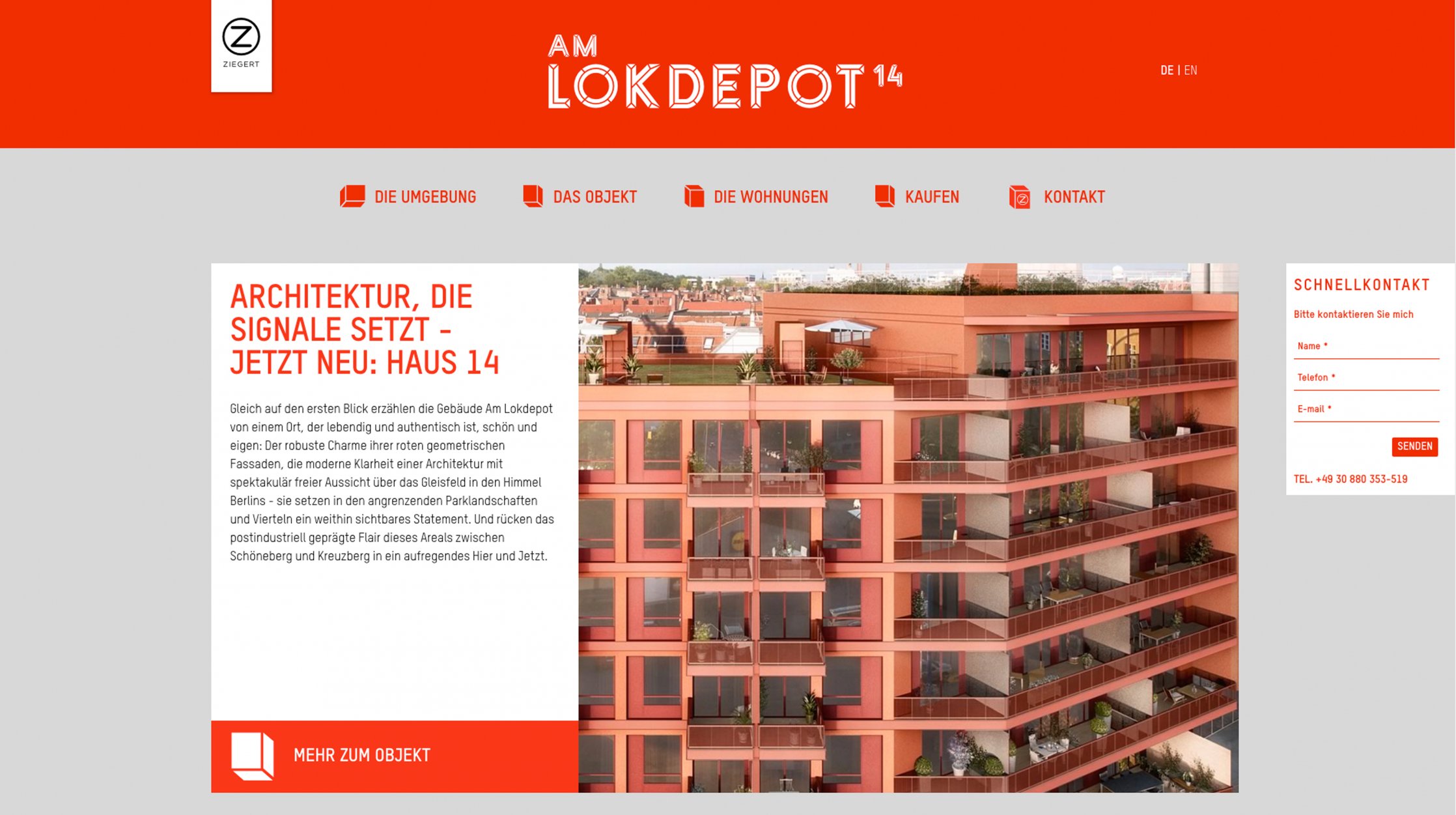
Conceptualization and design of the logo, exposé, short exposé and website.
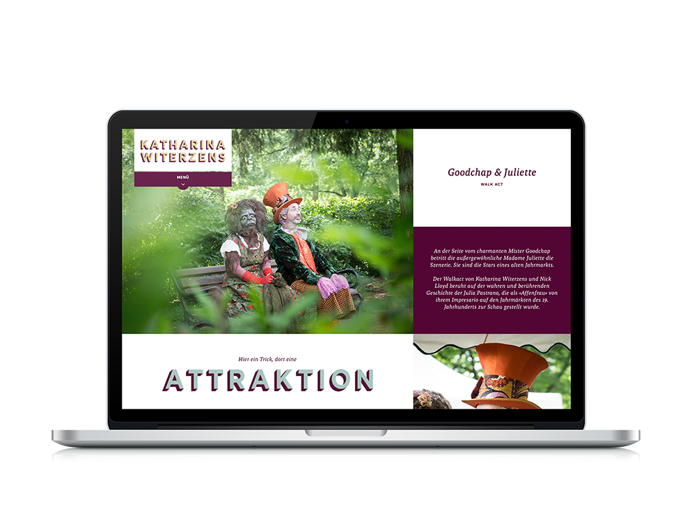
You can find the website here.
Print.Branding.Web + Interface Design.Type + Lettering
CLIENT
Ziegert Immobilien
COMMISSION
MüllerValentini
CREDITS
in Collaboration with Max Boiger