Berlin Schönefeld station that connects the airport and Berlin is in need of substantial structural and visual improvement. Disoriented travelers are experiencing a lack of or misleading signage, absence of orientation, provisional solutions, visual chaos of duplicated or poorly structured information as well as abandoned and unkempt areas.
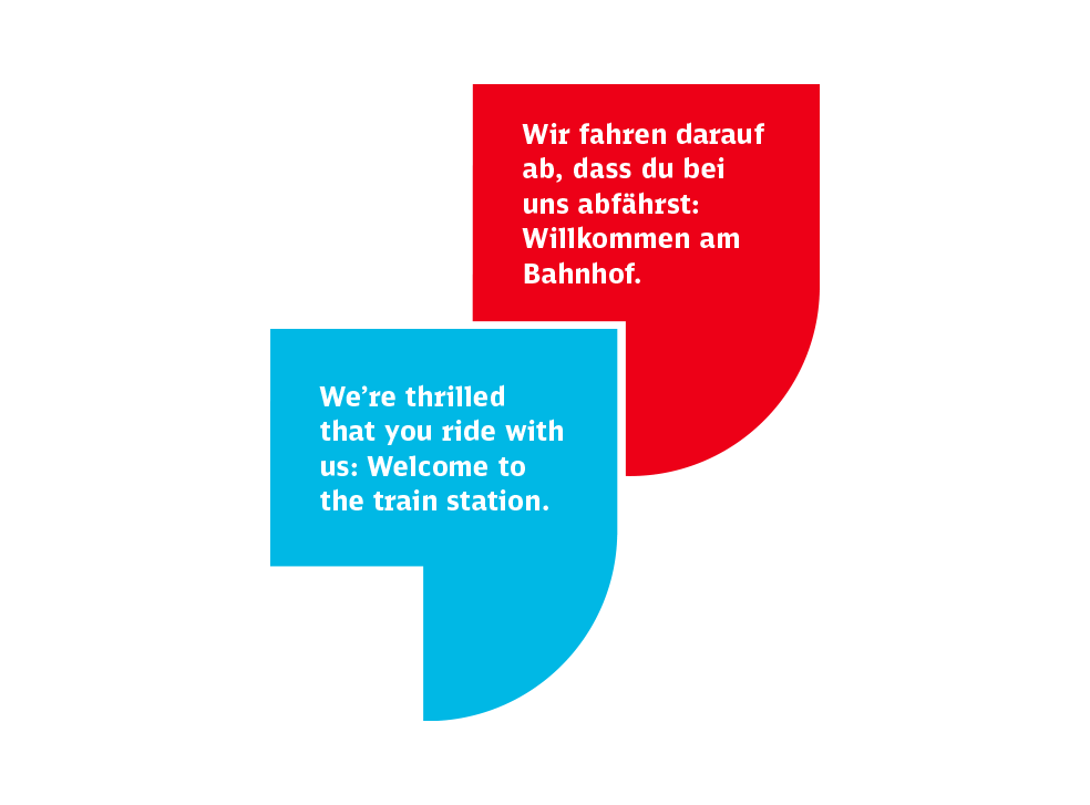
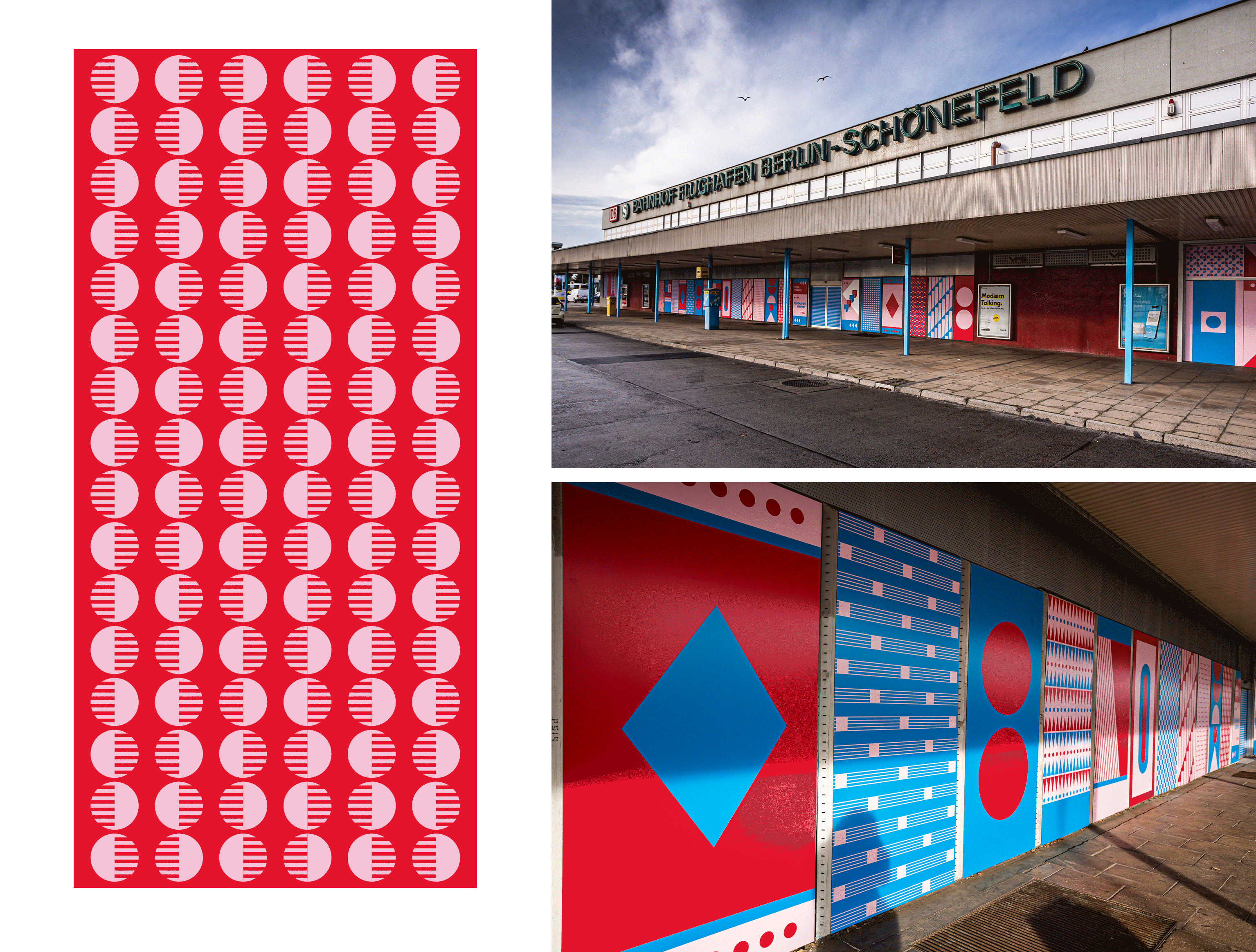
The development of a wayfinding and orientation concept as a meta-level preceded an in-depth analysis of the problem areas and weak points not only within the station building but also the surrounding area. A colorful and identity-creating concept was developed for and with beMATES Creative in a long process of analysis, testing, restructuring and development of hierarchies and elements. The conceptual guiding idea ›Cultural Playground Berlin‹, is intended to appeal directly and indirectly to station visitors and act as a visual and communicative gateway to our capital city. Through an agile concept with an eye-catching graphic identity, the theme ›Conversation‹ is translated.
Wayfinding.Public Space Design
CREDITS
Commission › beMATES Creative
Creative Direction › beMATES Creative
Photos Location › beMATES Creative
CLIENT
Deutsche Bahn
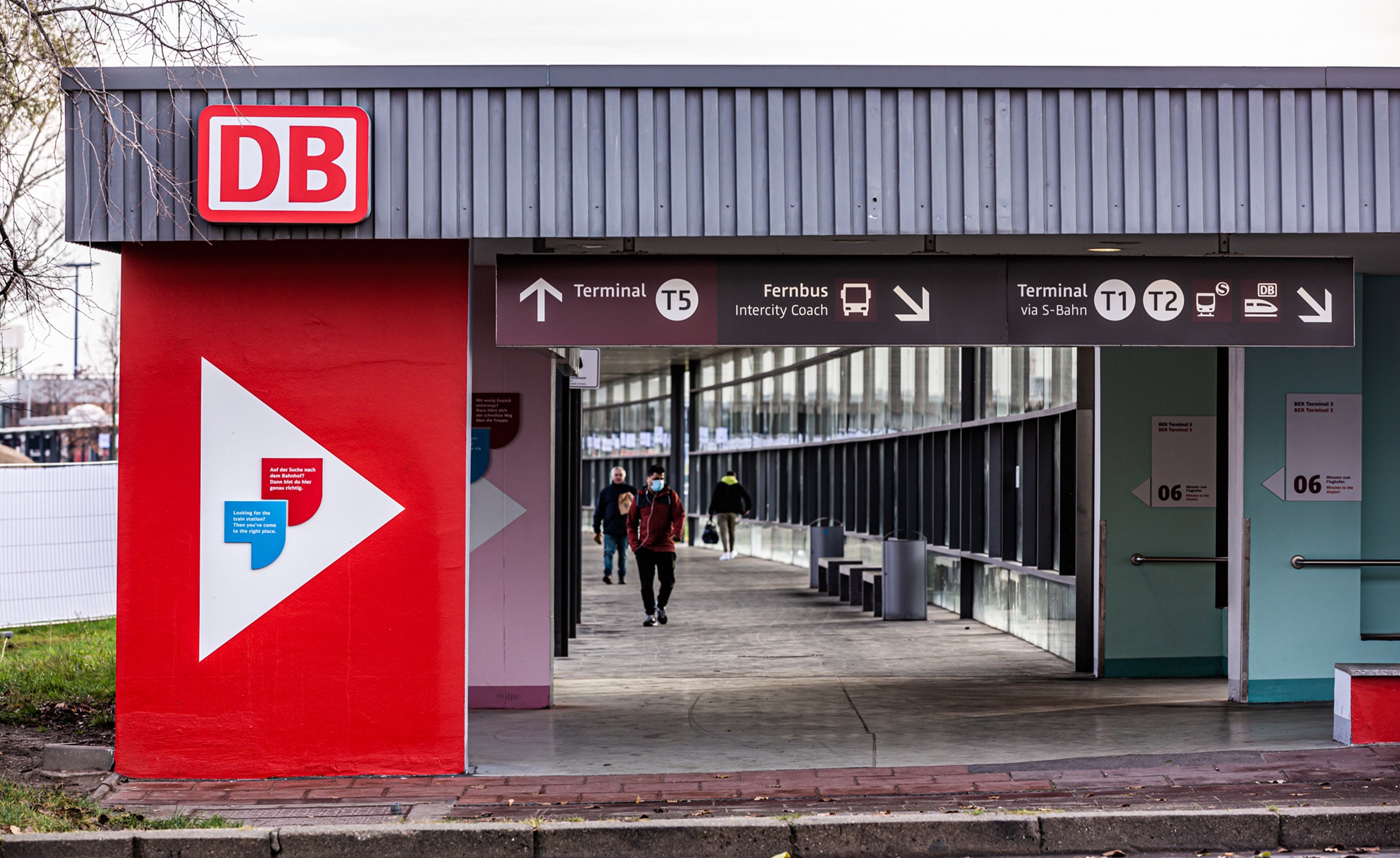
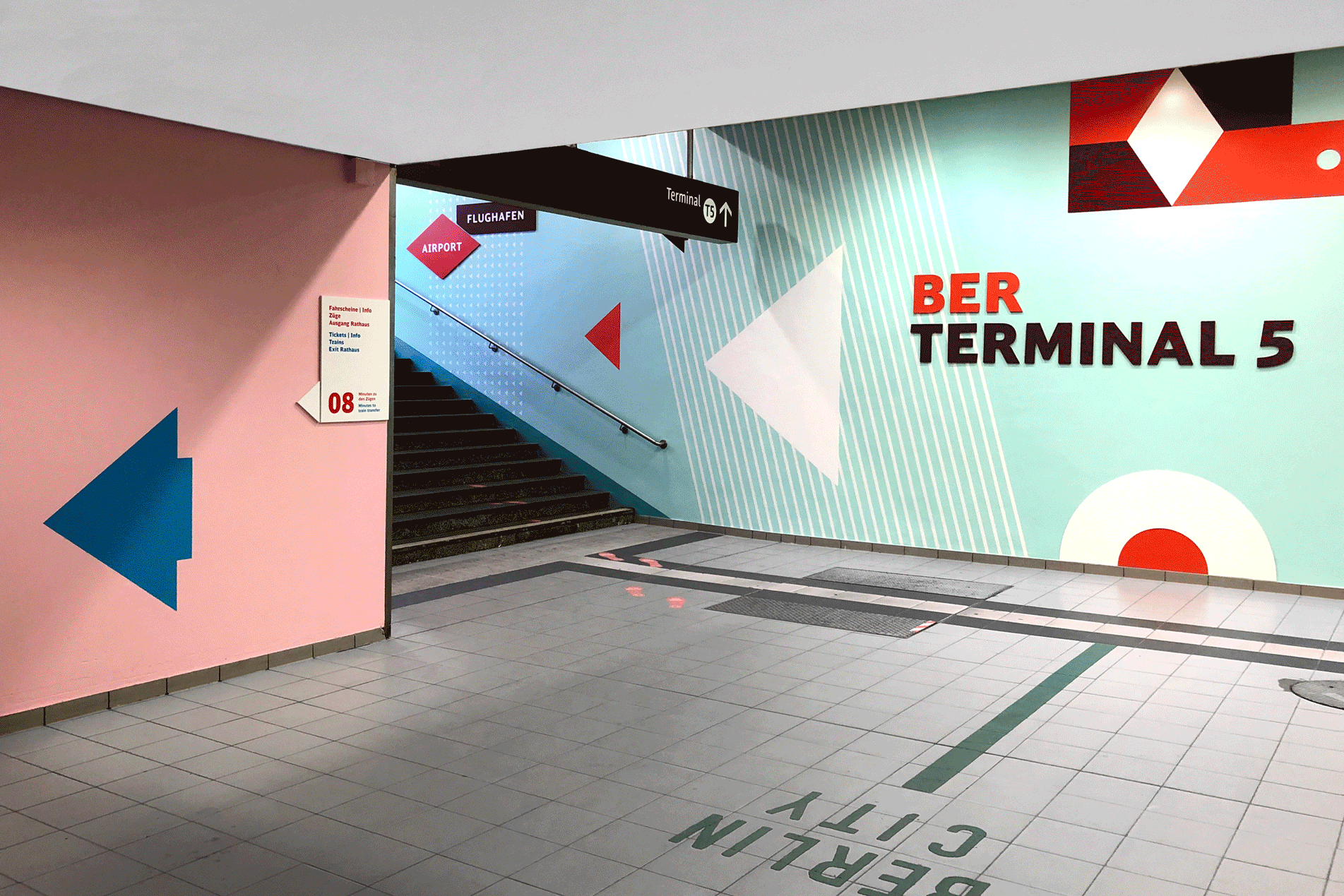
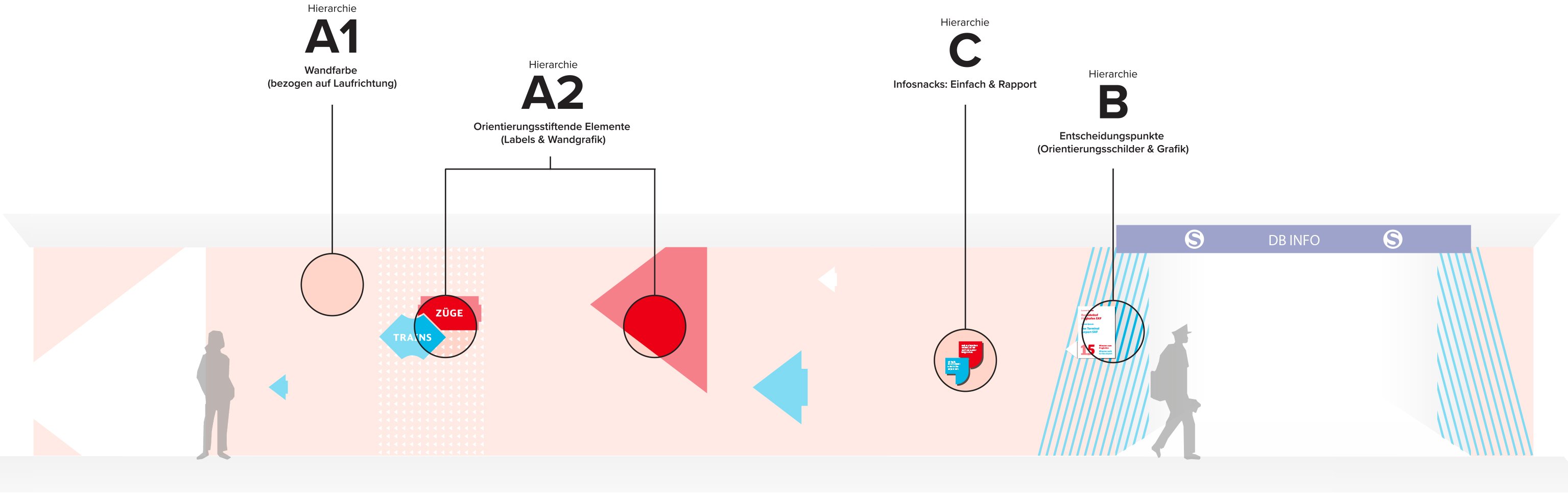
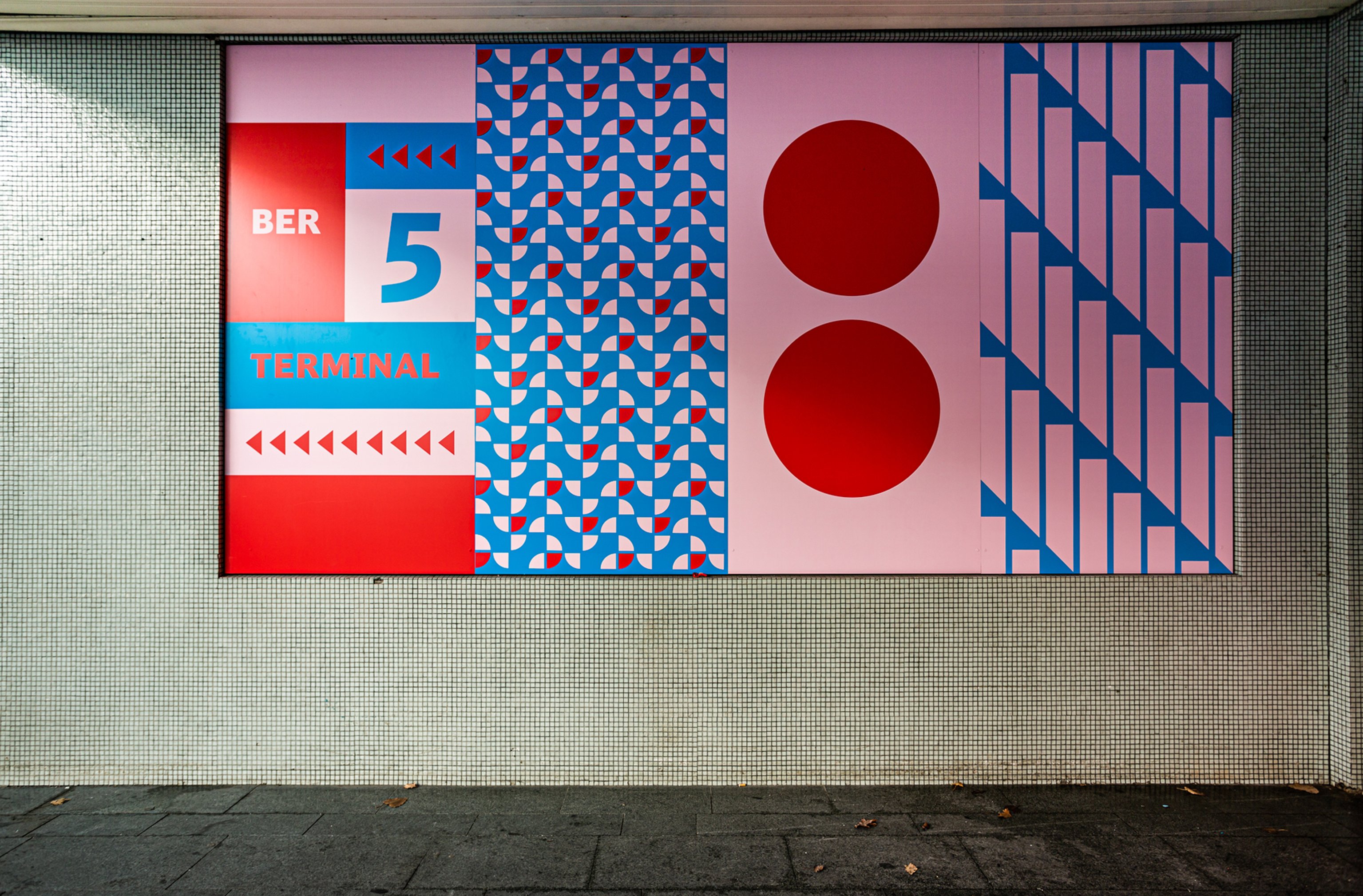
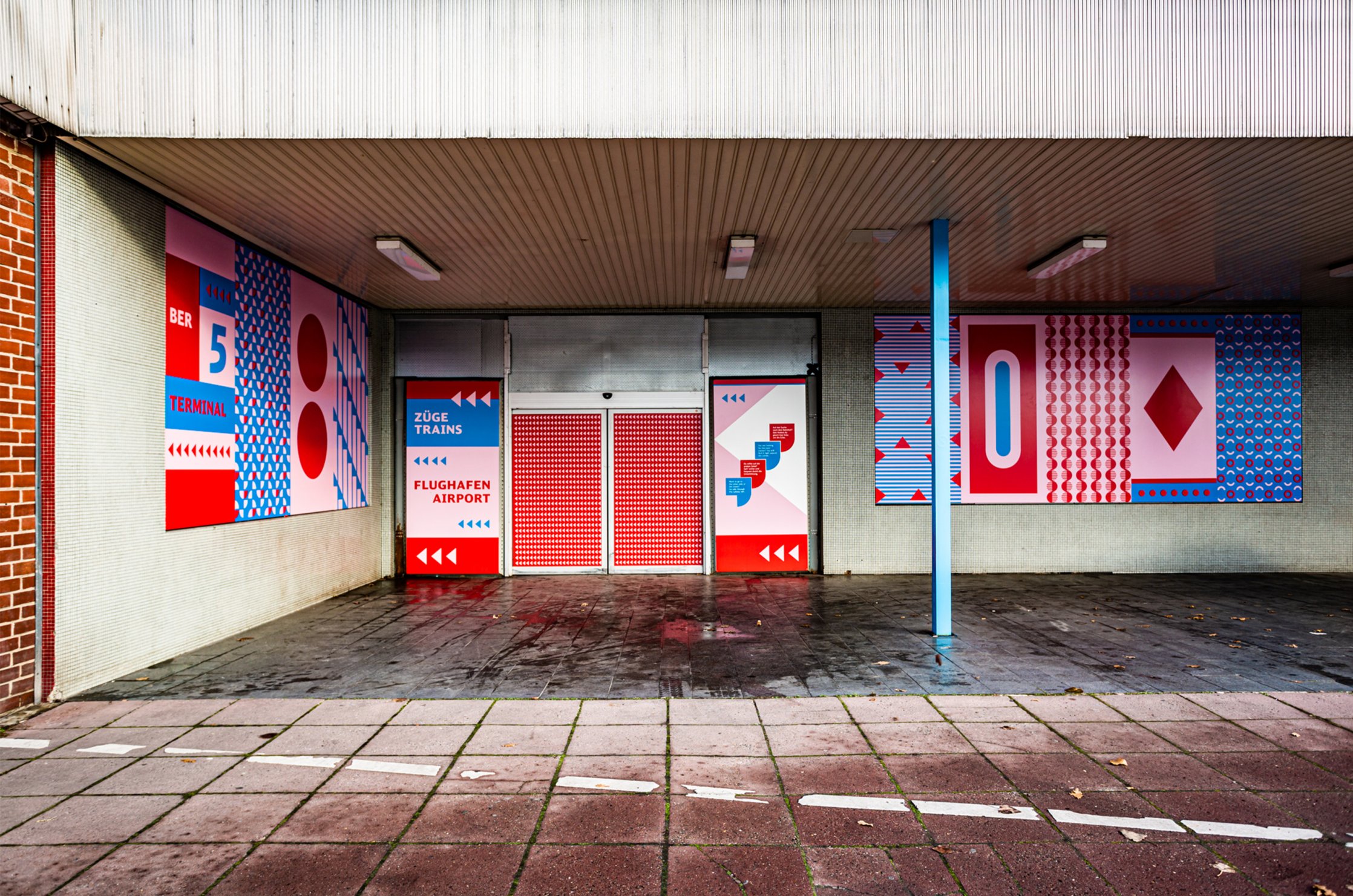
The central focus points/decision points in the station are at the center of the visual implementation. This is achieved through the content-related and visual bracketing of the defined decision points and the graphic-communicative image that continues from there. We position visual ›communication points‹ that bring the station to life - here in the contextual and figurative sense.
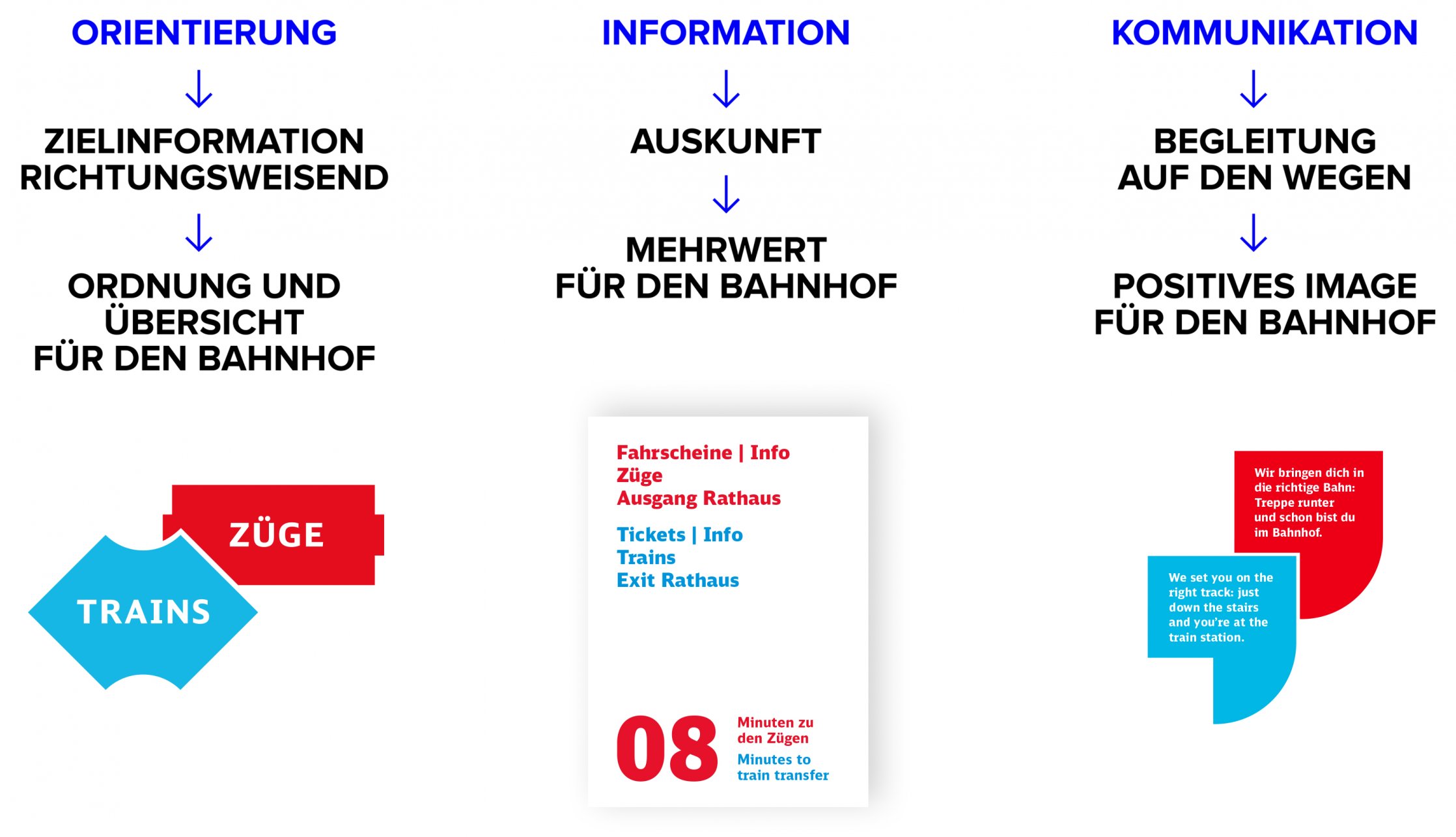
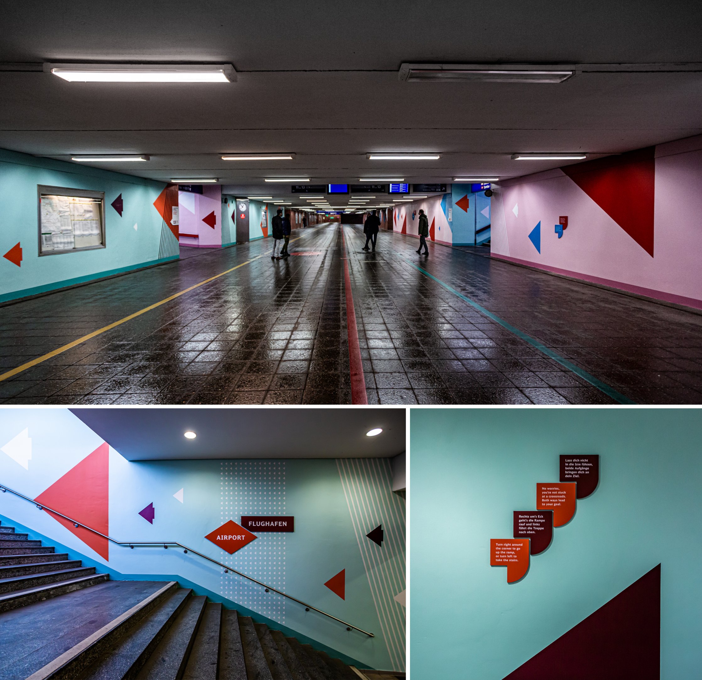
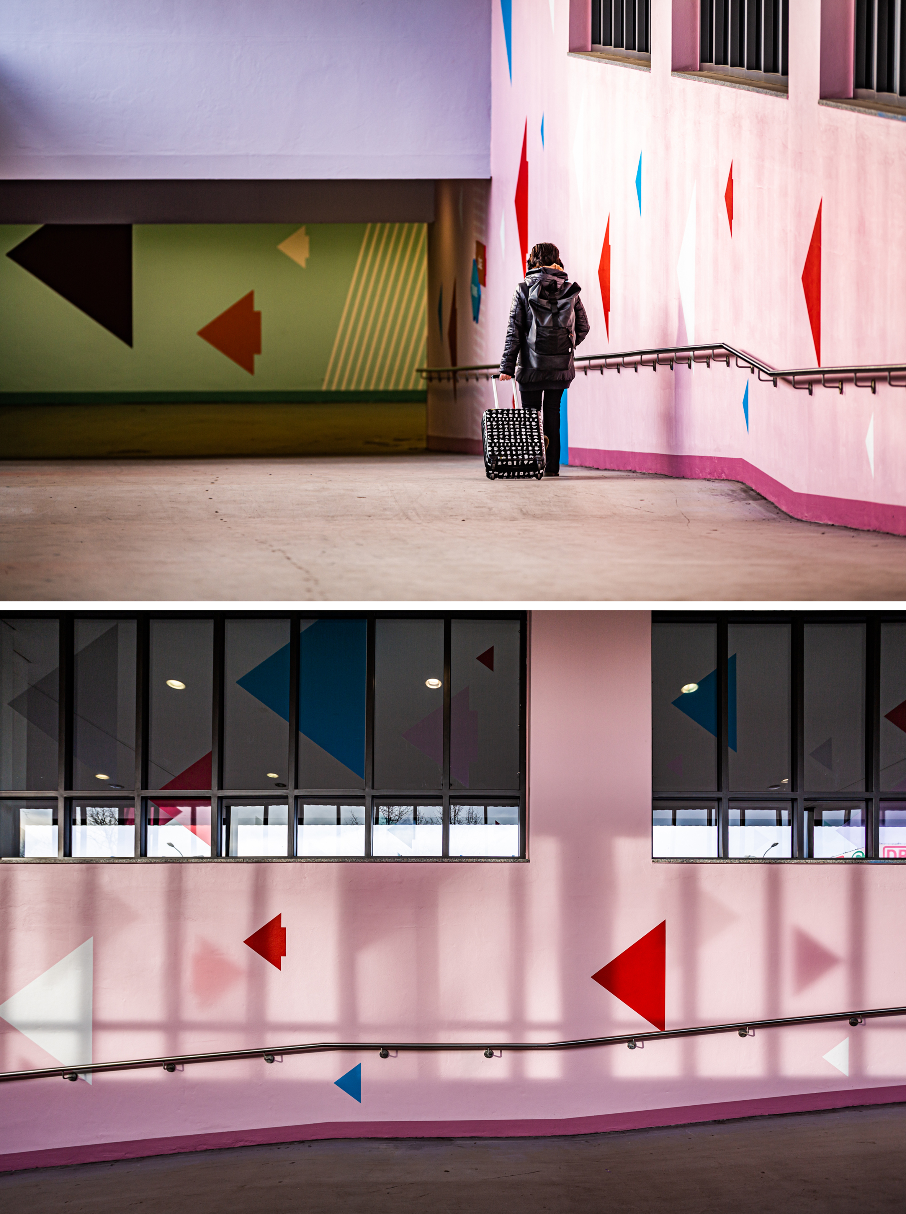
In order to position ourselves as a meta-level within the space, we set ourselves apart from the existing structure in terms of color. Each track direction has its own color combination, so that the traveler gets a clear orientation at first glance. Supportive of this, the info snacks are also kept in the respective color scheme to show a clear allocation.
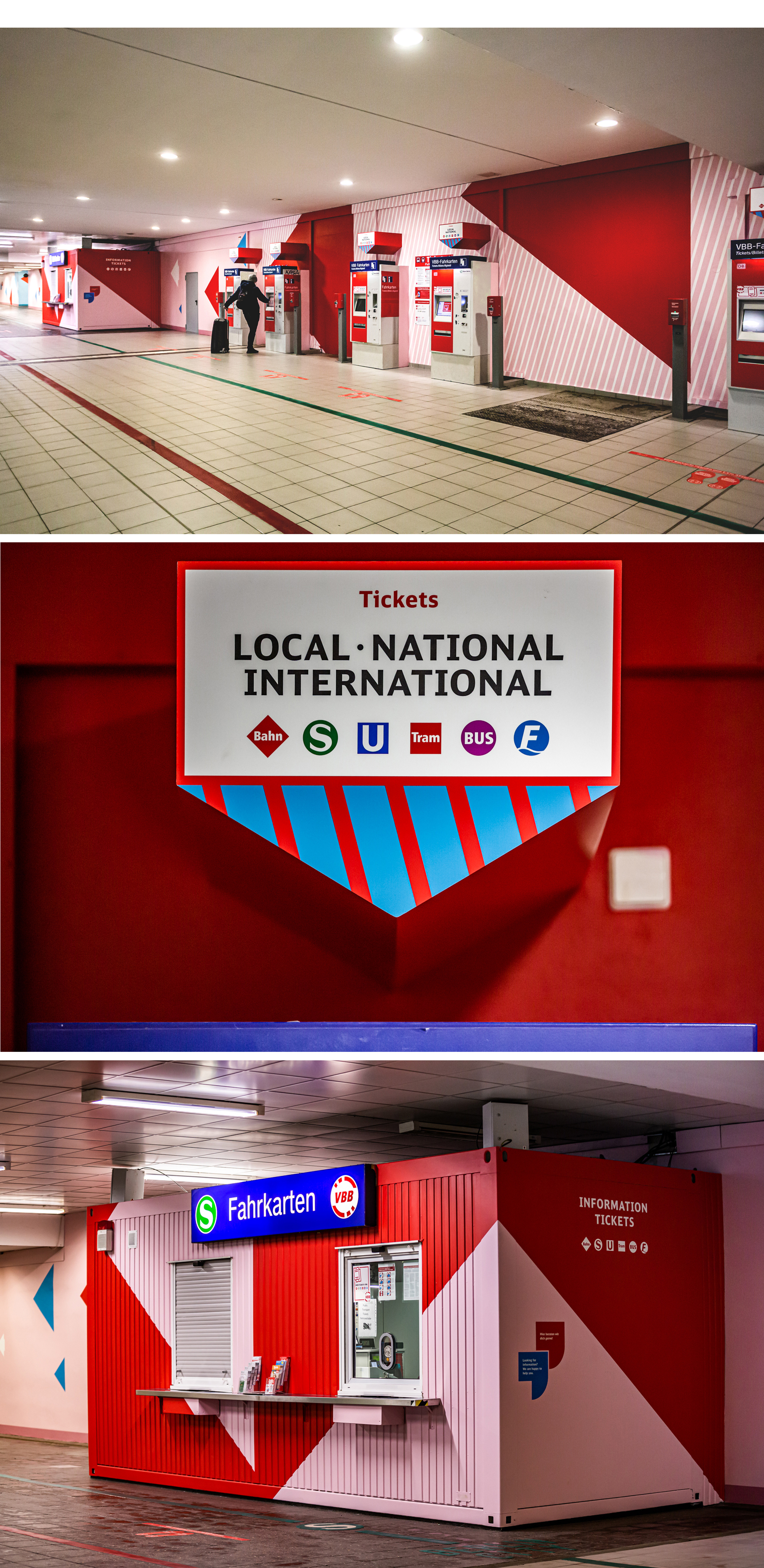
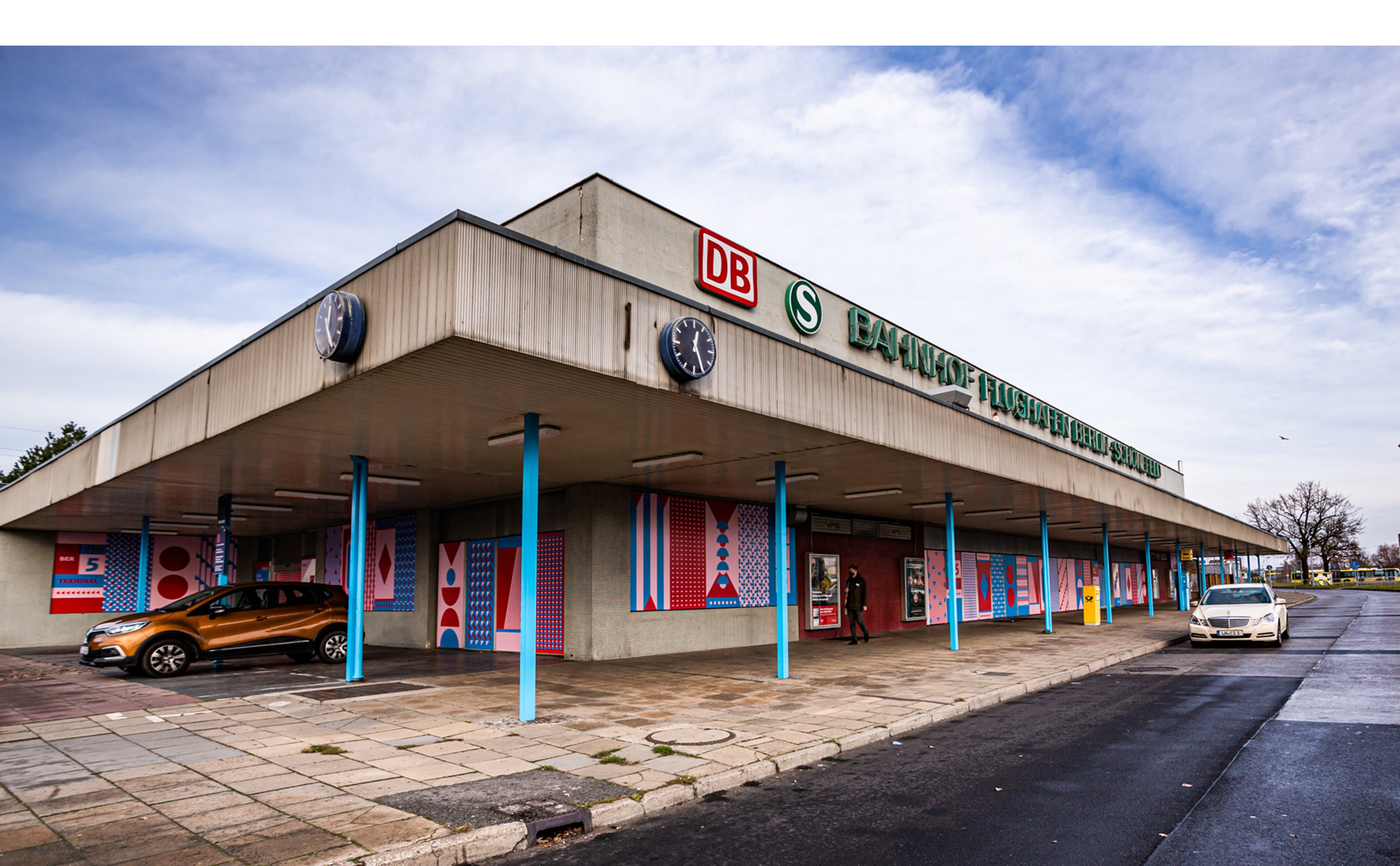
›Vending machine beanies‹ are placed above the ticket machines to provide striking and quick information. The ticket container in the pedestrian subway is showcased. This will ensure that the ticket counter and the information will also be noticed by future travelers.
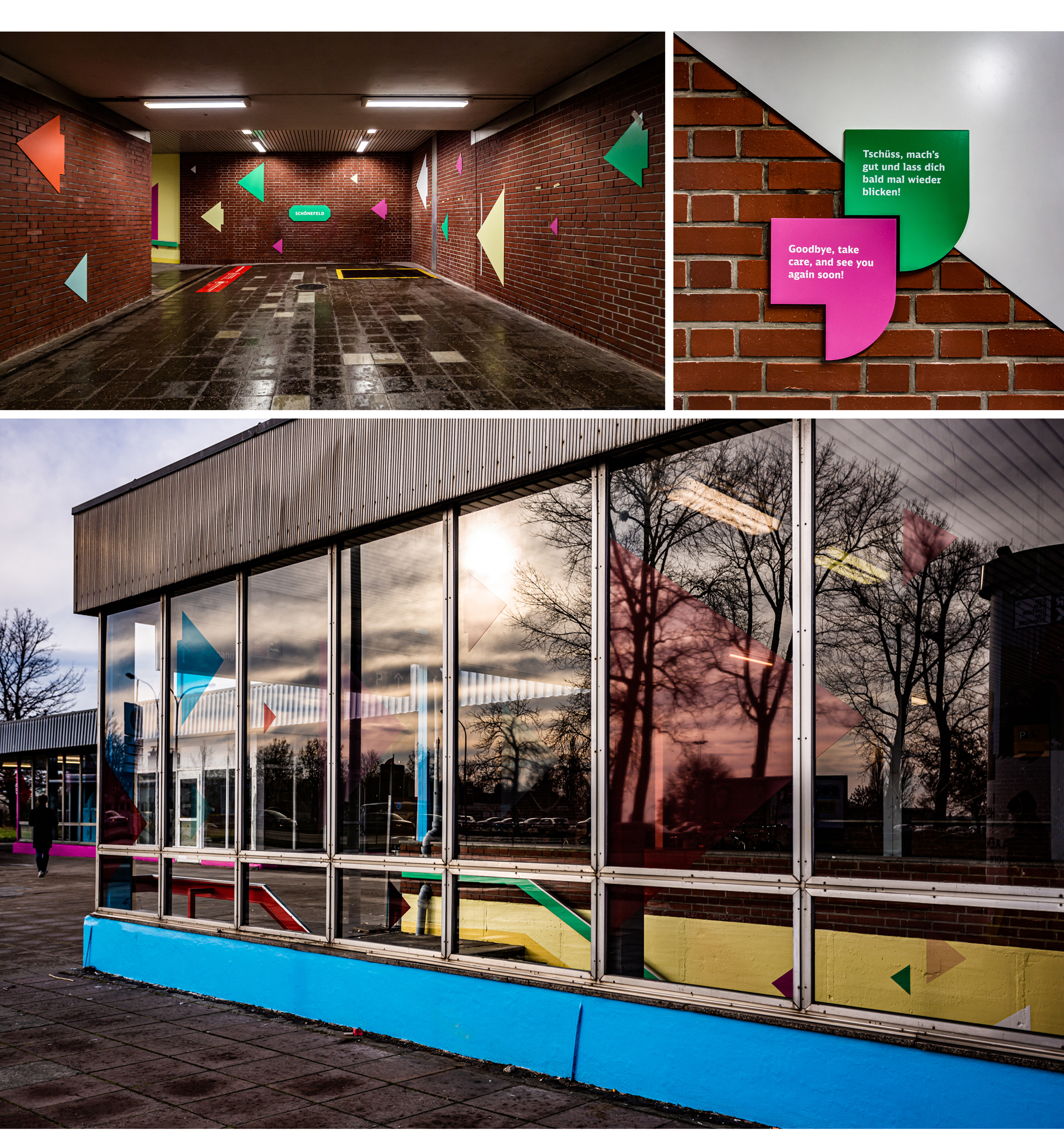
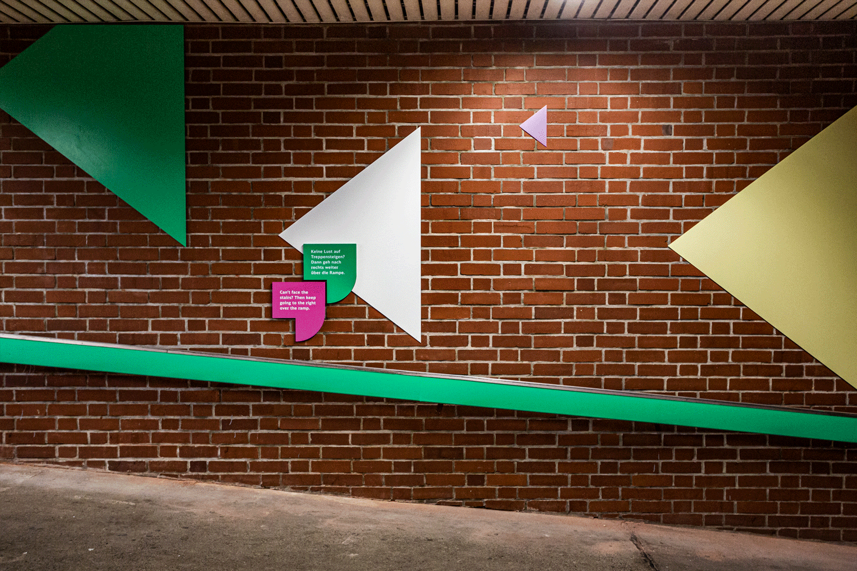
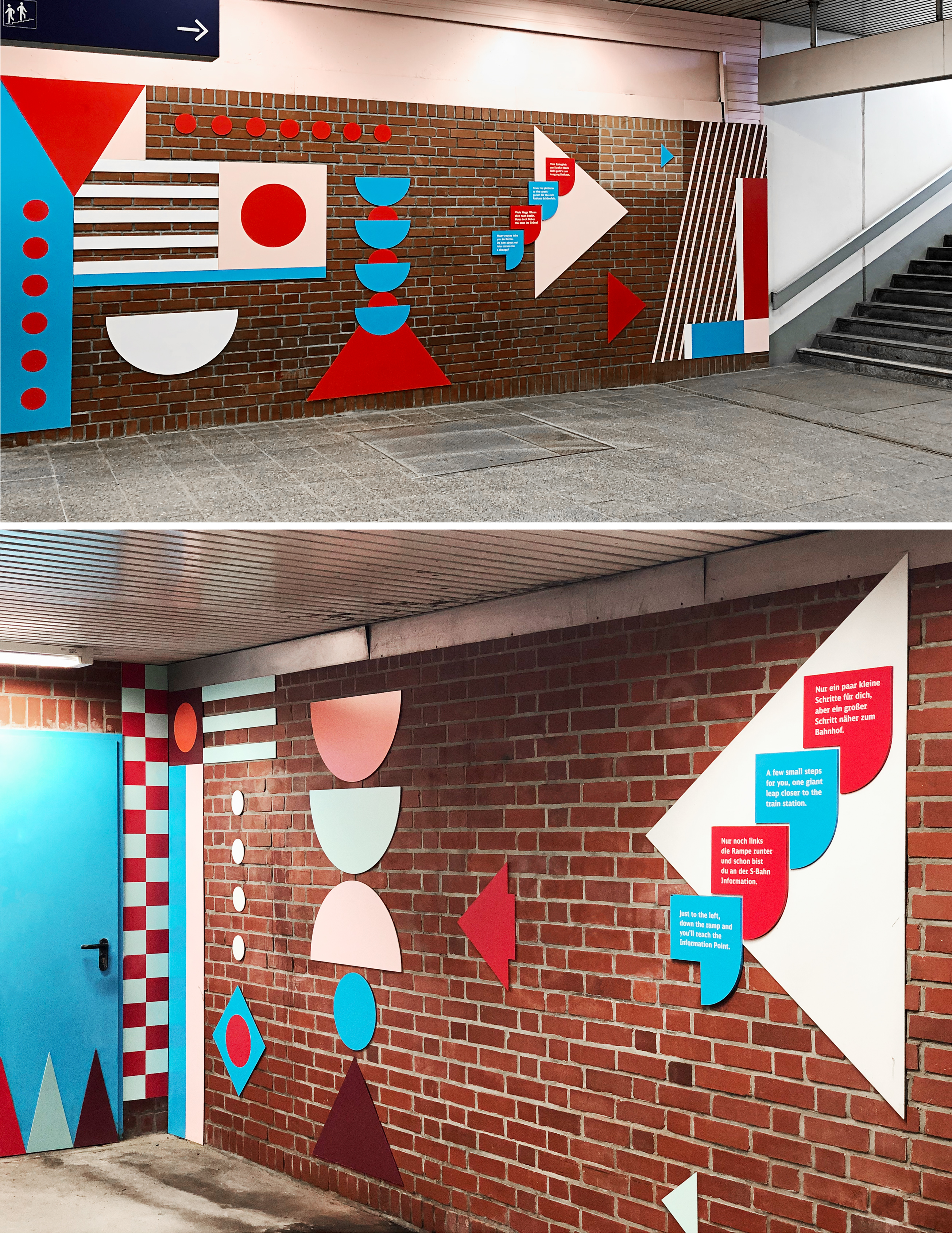
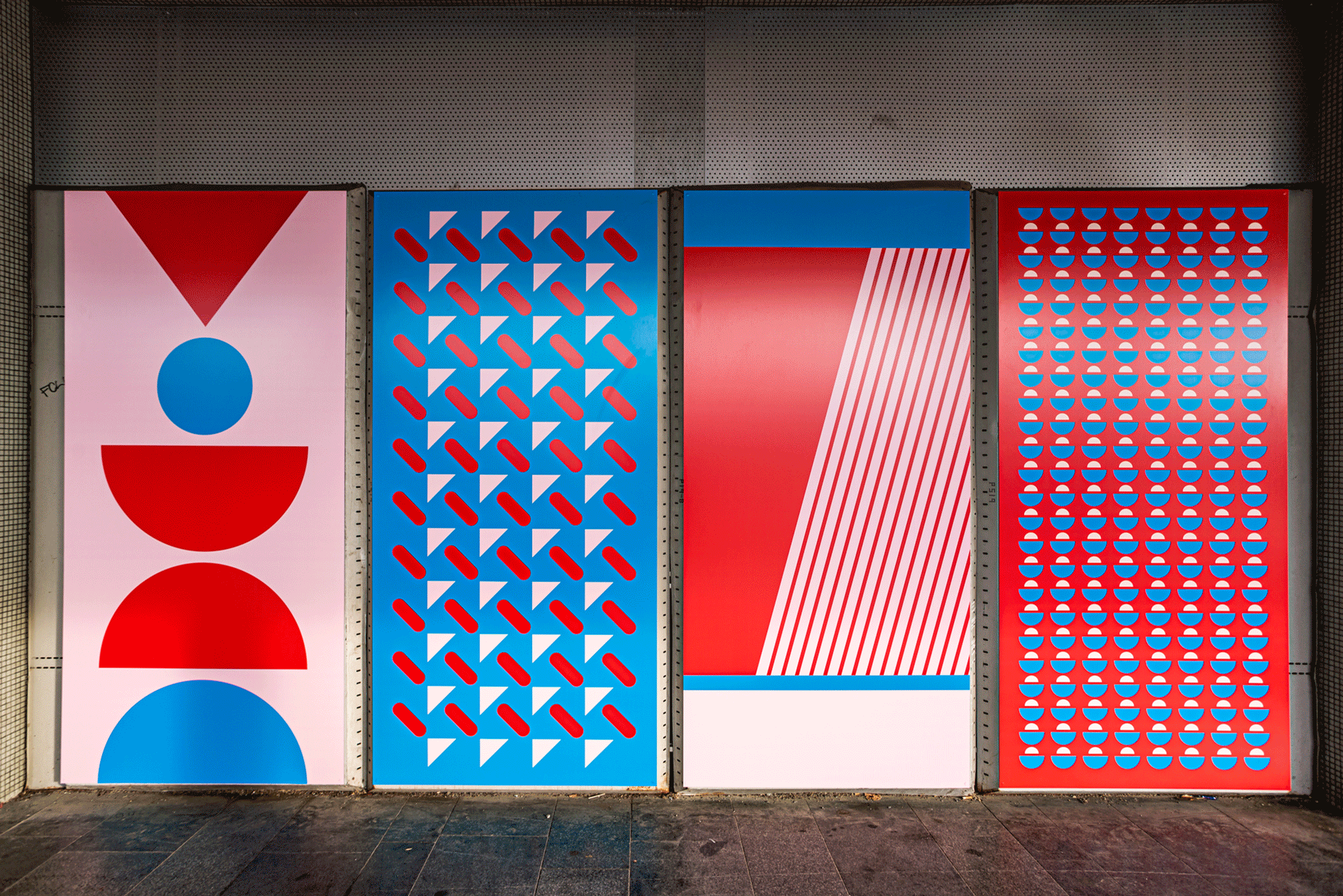
We are embellishing unused areas and scary areas within the station with a combination of form and color to create sculptural elements. These elements are placed in an eye-catching and playful way to visually brighten up the area and make people feel welcome. The impression that this area is run-down and not used is replaced by a friendly atmosphere that accompanies travelers and guides them through the station with visually strong elements.
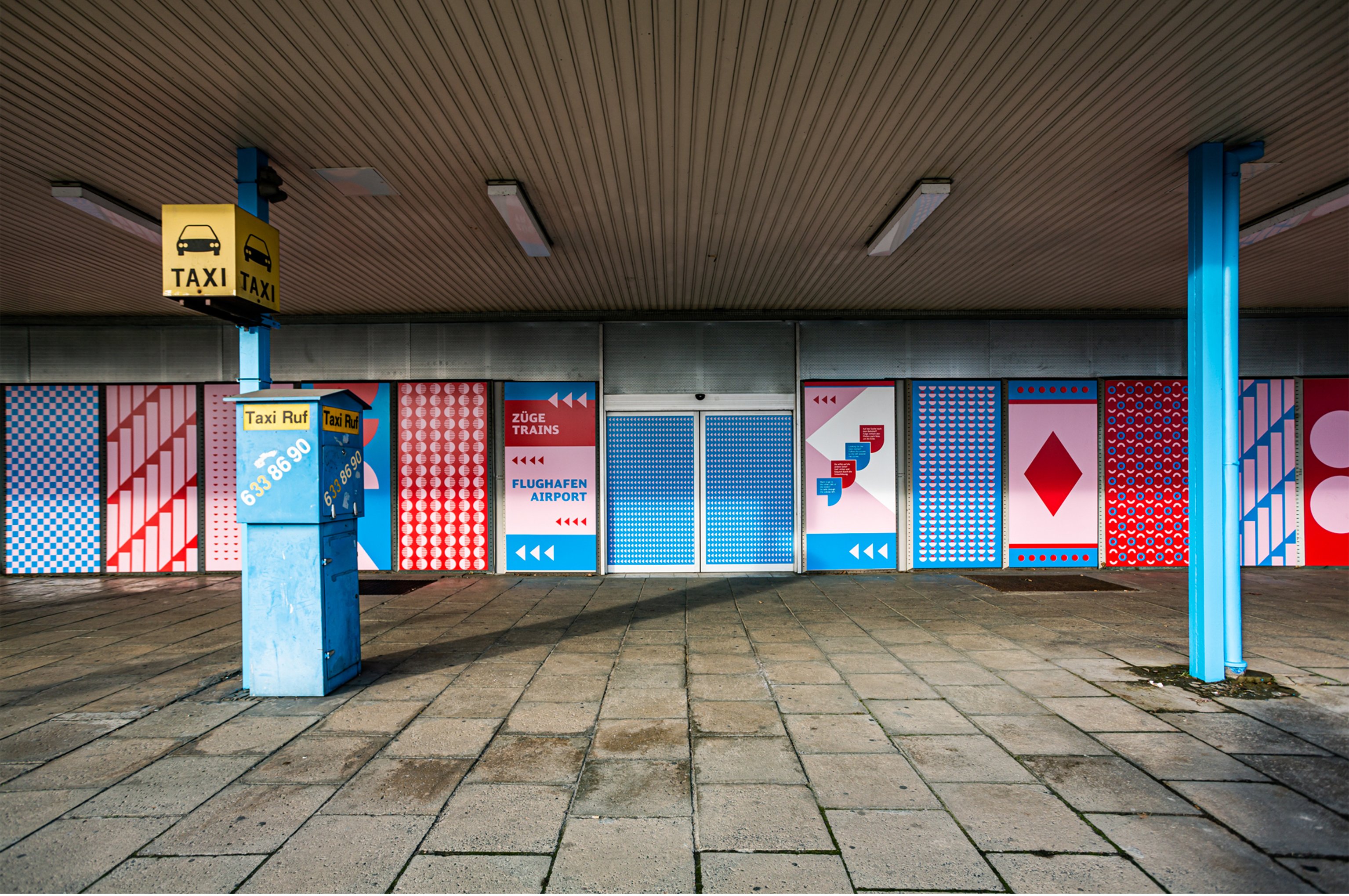
The walls and the area around the former reception building looked run-down and unkempt. This corner was avoided by travelers. This created a scary area due to the absence of travelling tourists.
We entrenched a flexible layout composition that flowed from our overall concept. The area is significantly embellished through the visual display of the current scary zone. We further develop our concept of the existing situation and bring existing areas to life. The eye-catching approach attracts the attention of travelers and simultaneously creates zoning through the large-scale use of our graphic elements as patterns. A mix of proximity and distance in the formal design language encourages a variety of social interaction.