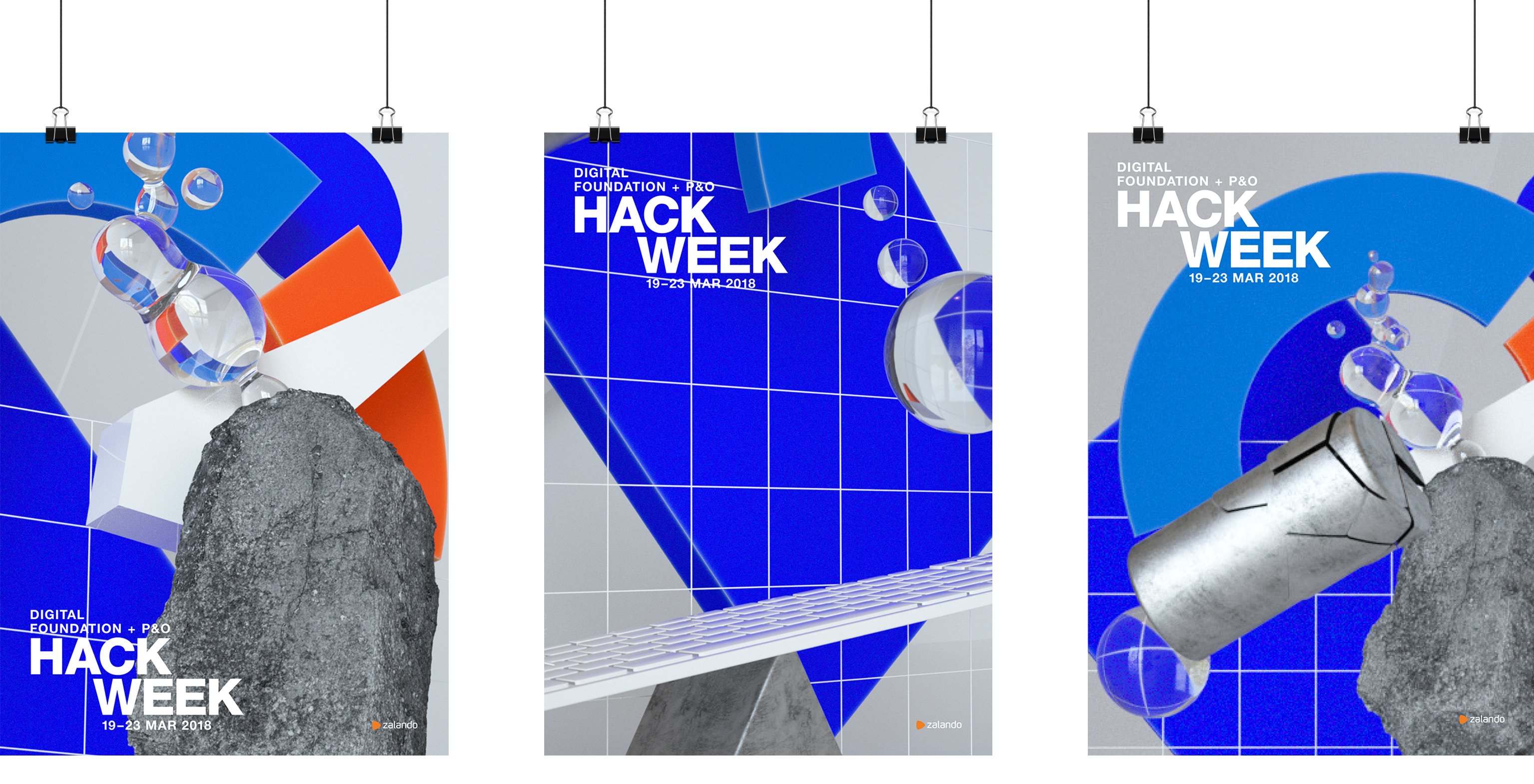
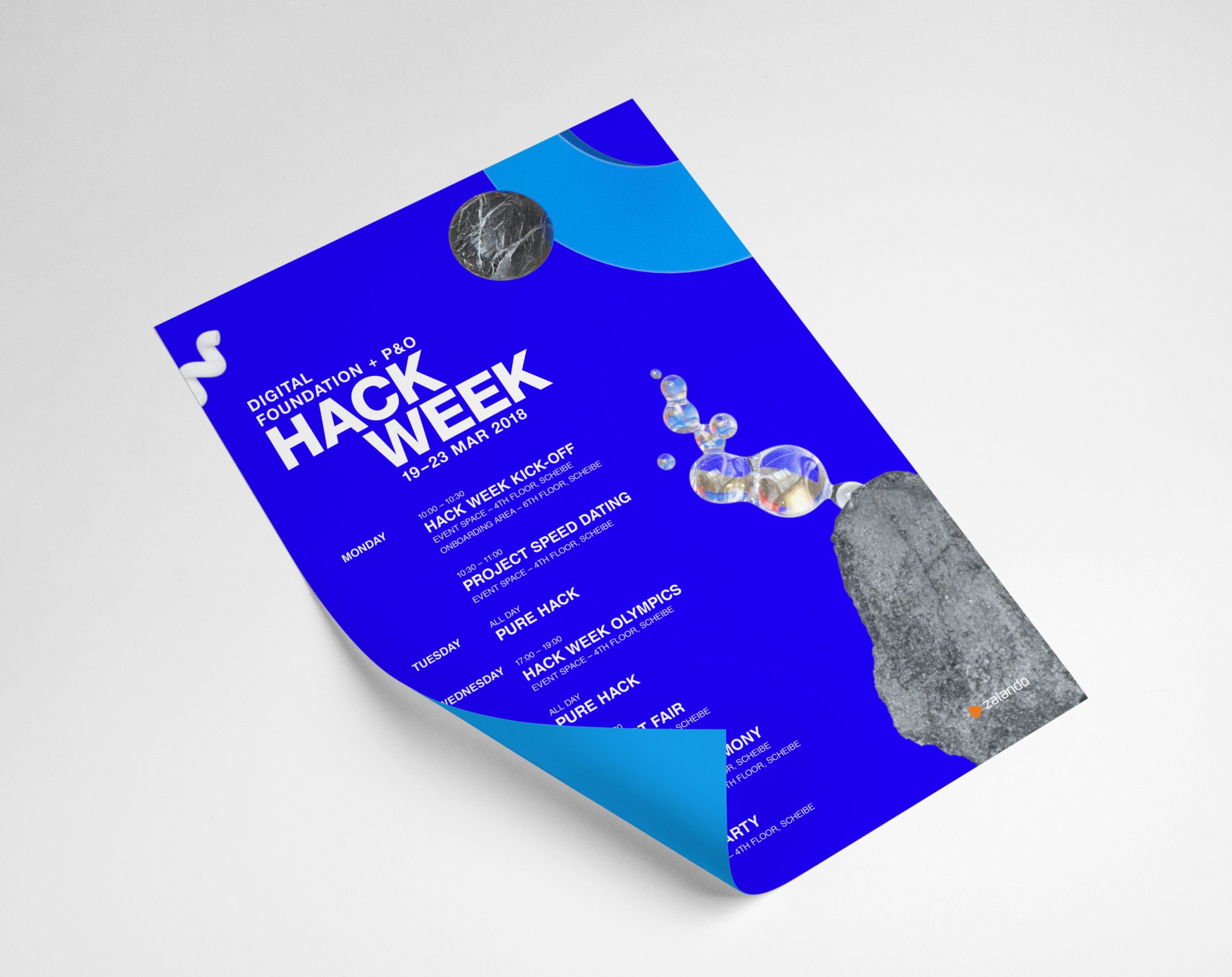
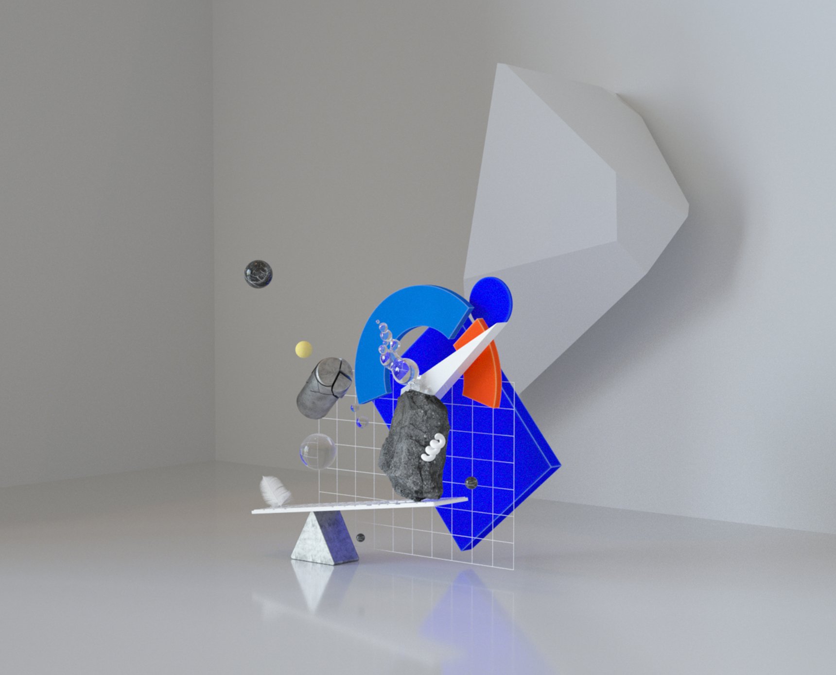
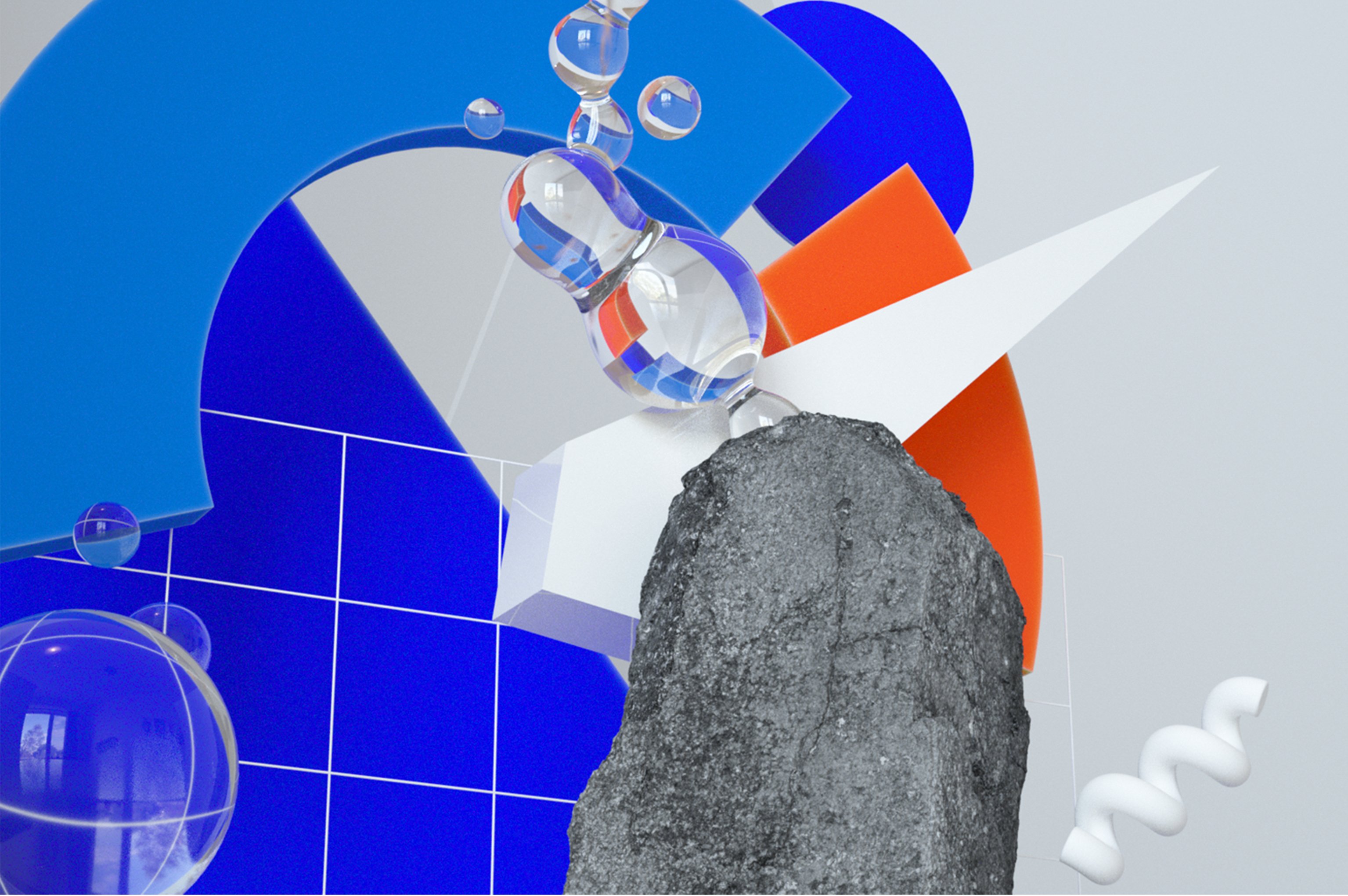
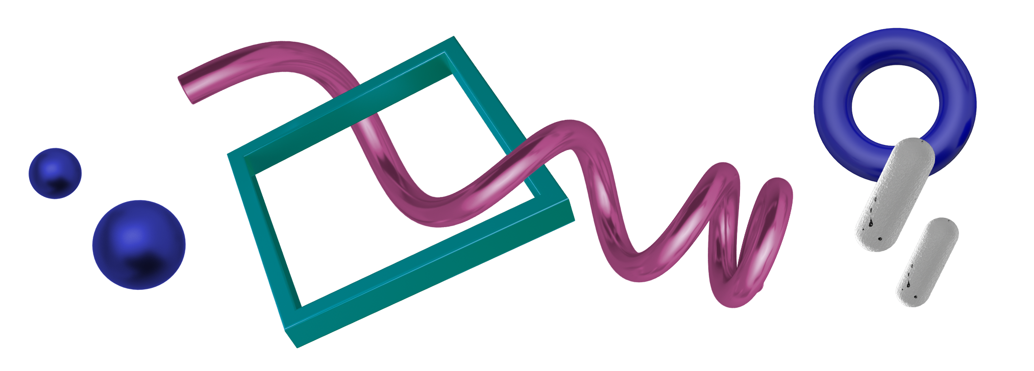
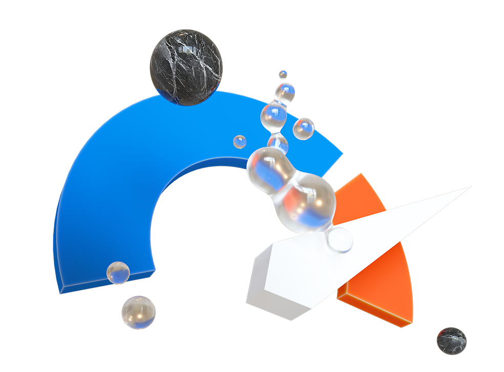
The Zalando ‹Hack Week› brand identity got a design refresh. Leaving behind the pixelated figures which had been the guiding principle of the design up until this point, the Hack Week visual identity now consists of semi-surreal, abstract 3D worlds which create themes and convey messages. We use three dimensional objects to create playful, yet sophisticated, ‹hacks› of our own, representing each specific business unit and its challenge with a specific color palette.
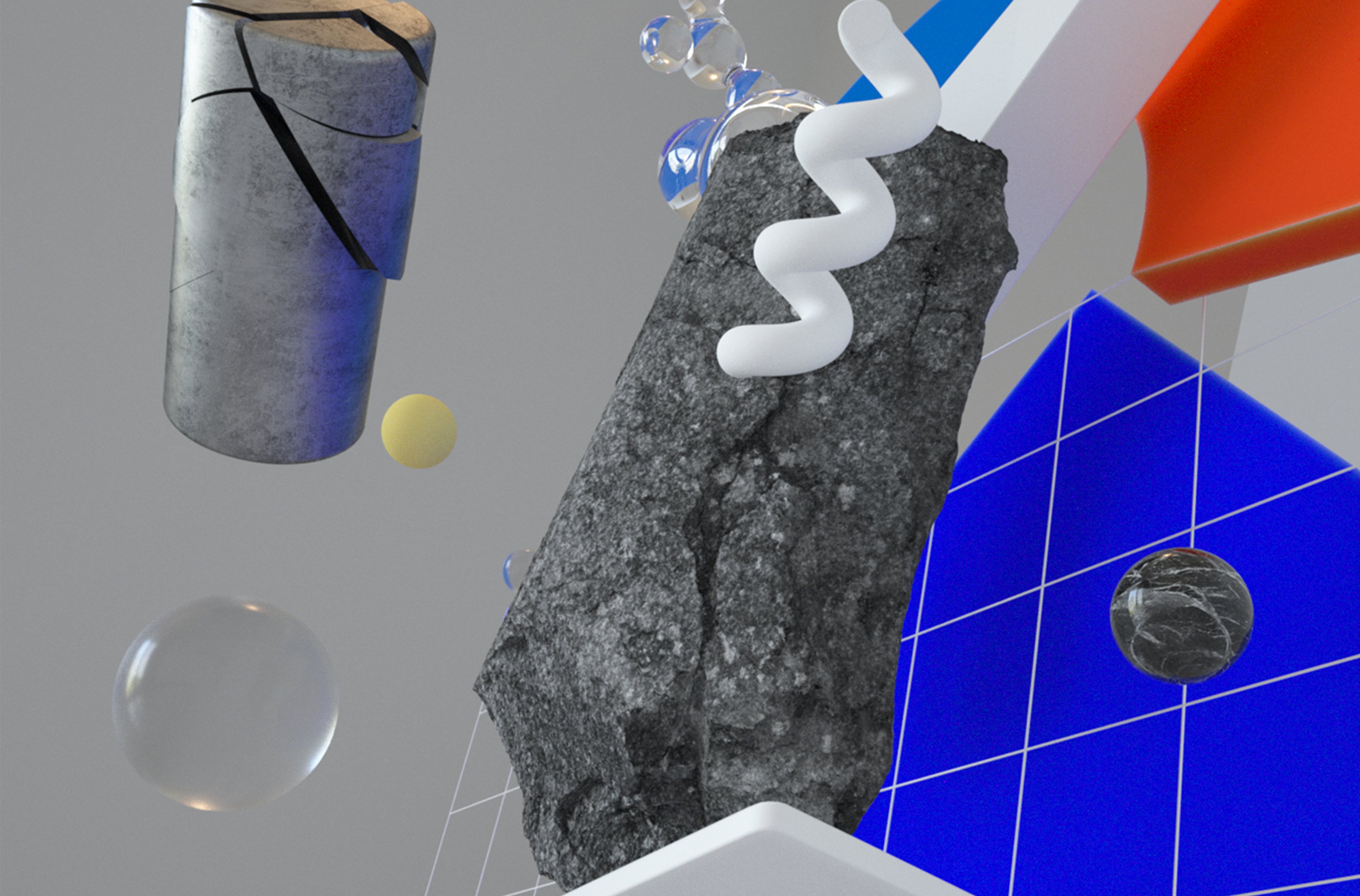
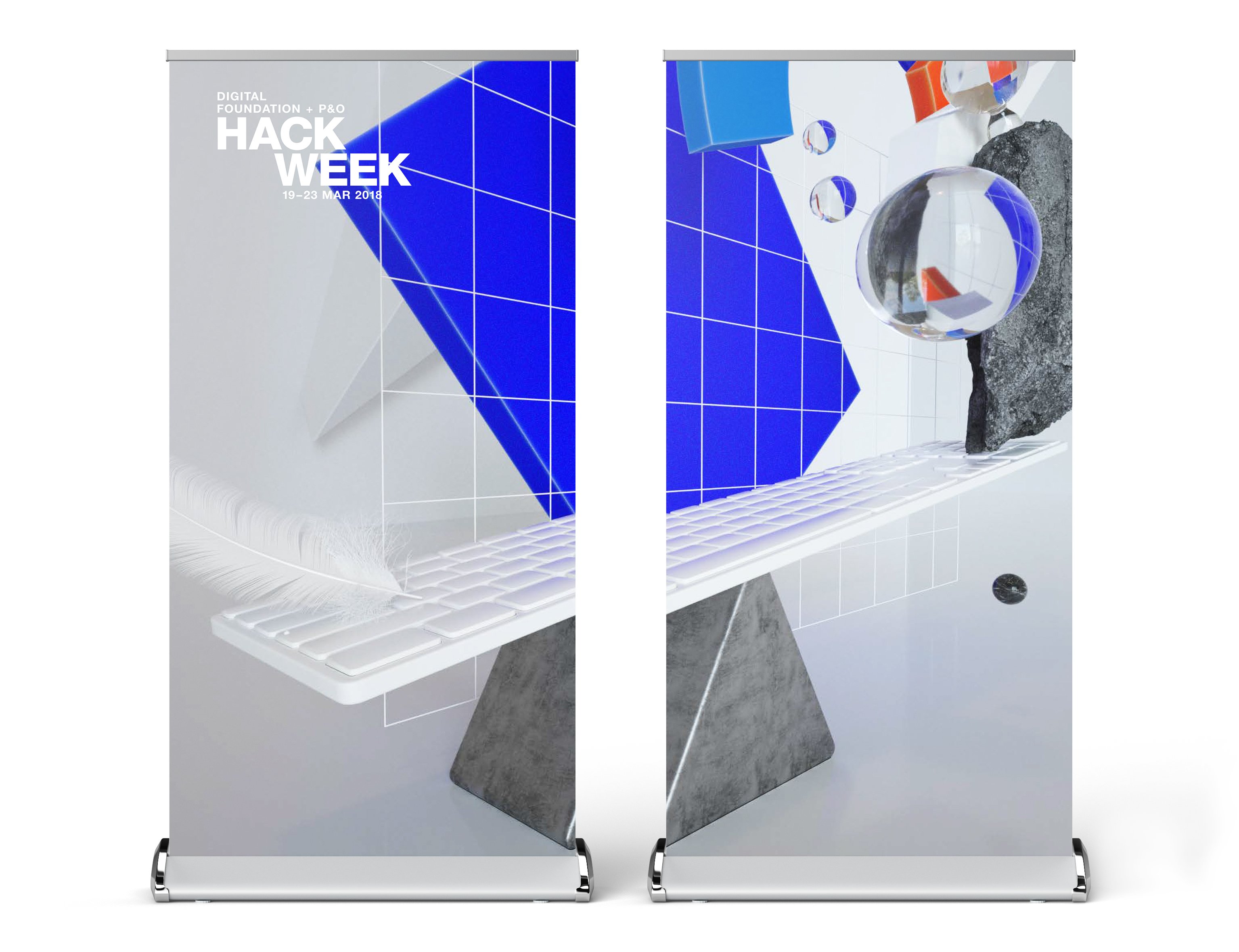
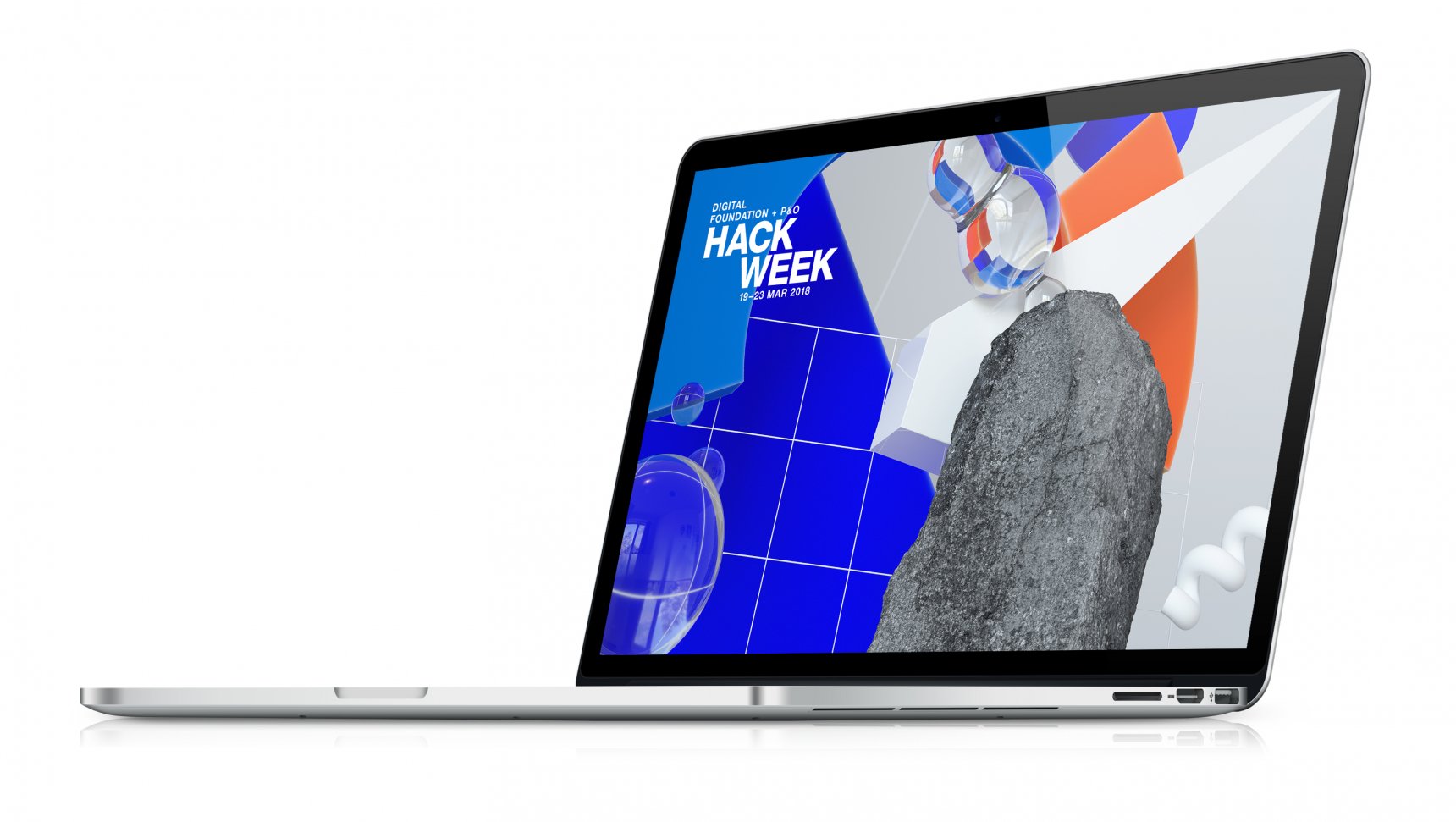
This theme of this year’s challenge was ‹move the needle.› We created a scene which captures the essence of both the ‹challenge› and the business unit. The whole scene was played across teaser assets to introduce the challenge. Close-ups and different angles were adapted for the event materials to symbolize a deep dive in the topic as well as the idea of viewing the challenge from different perspectives.
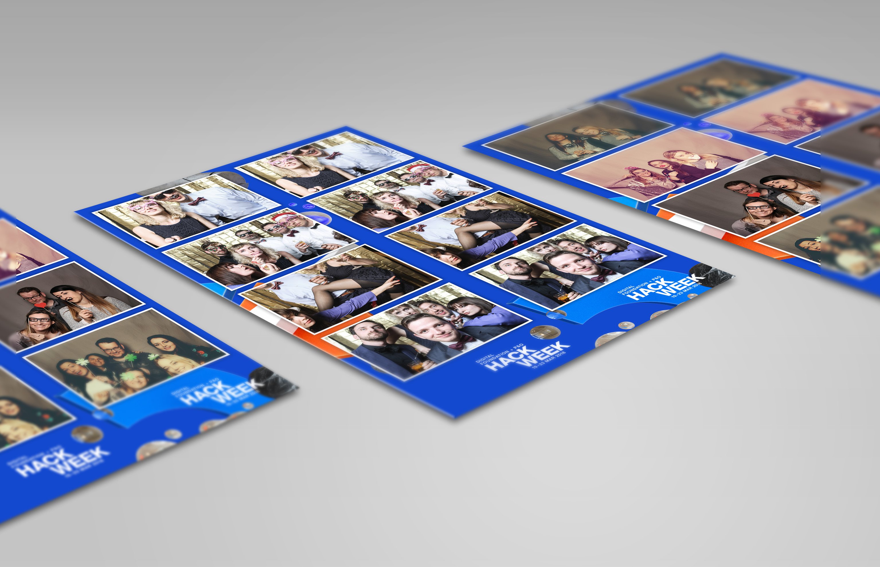
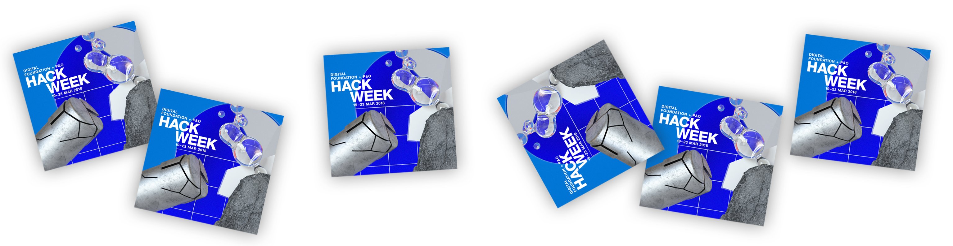
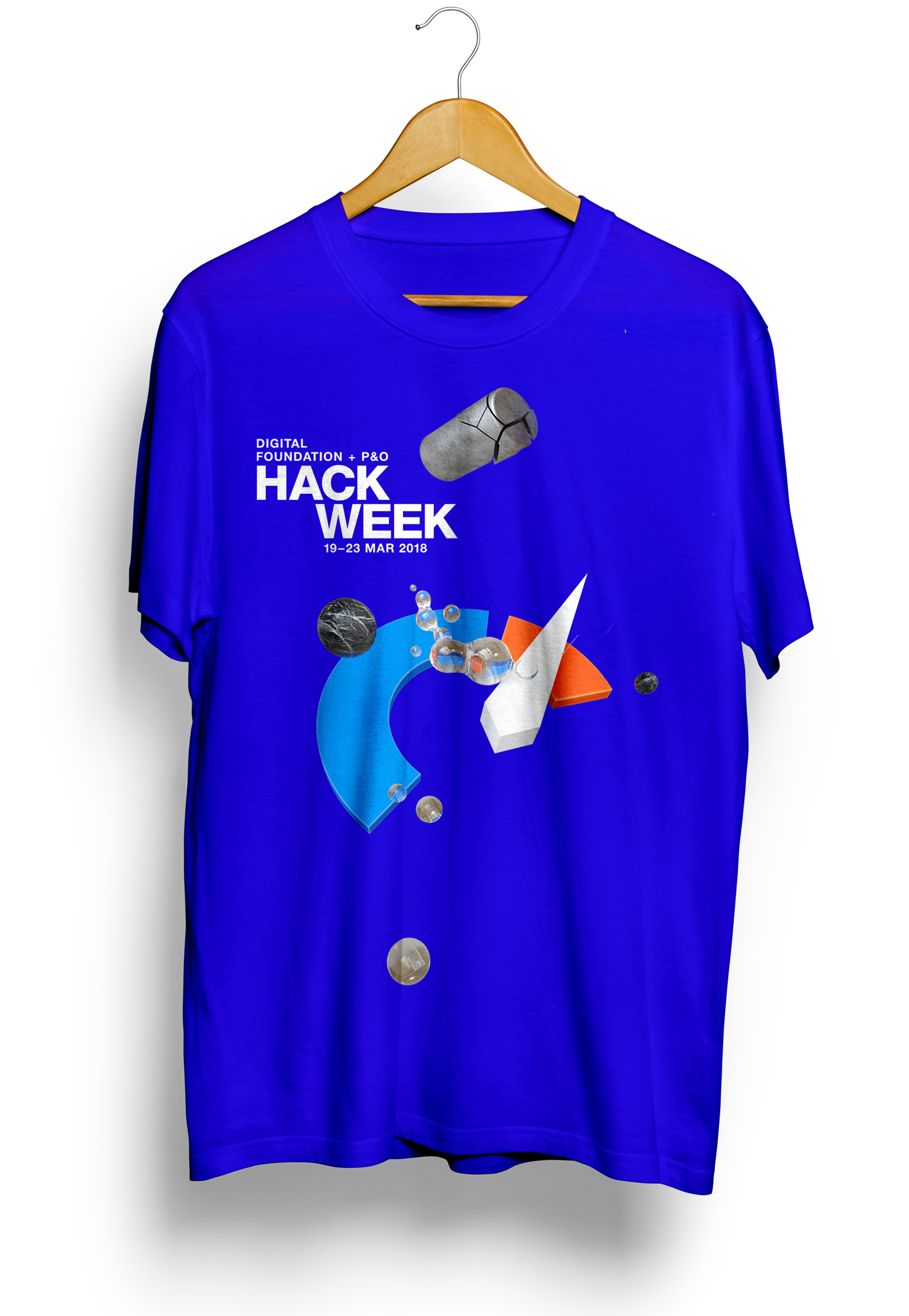
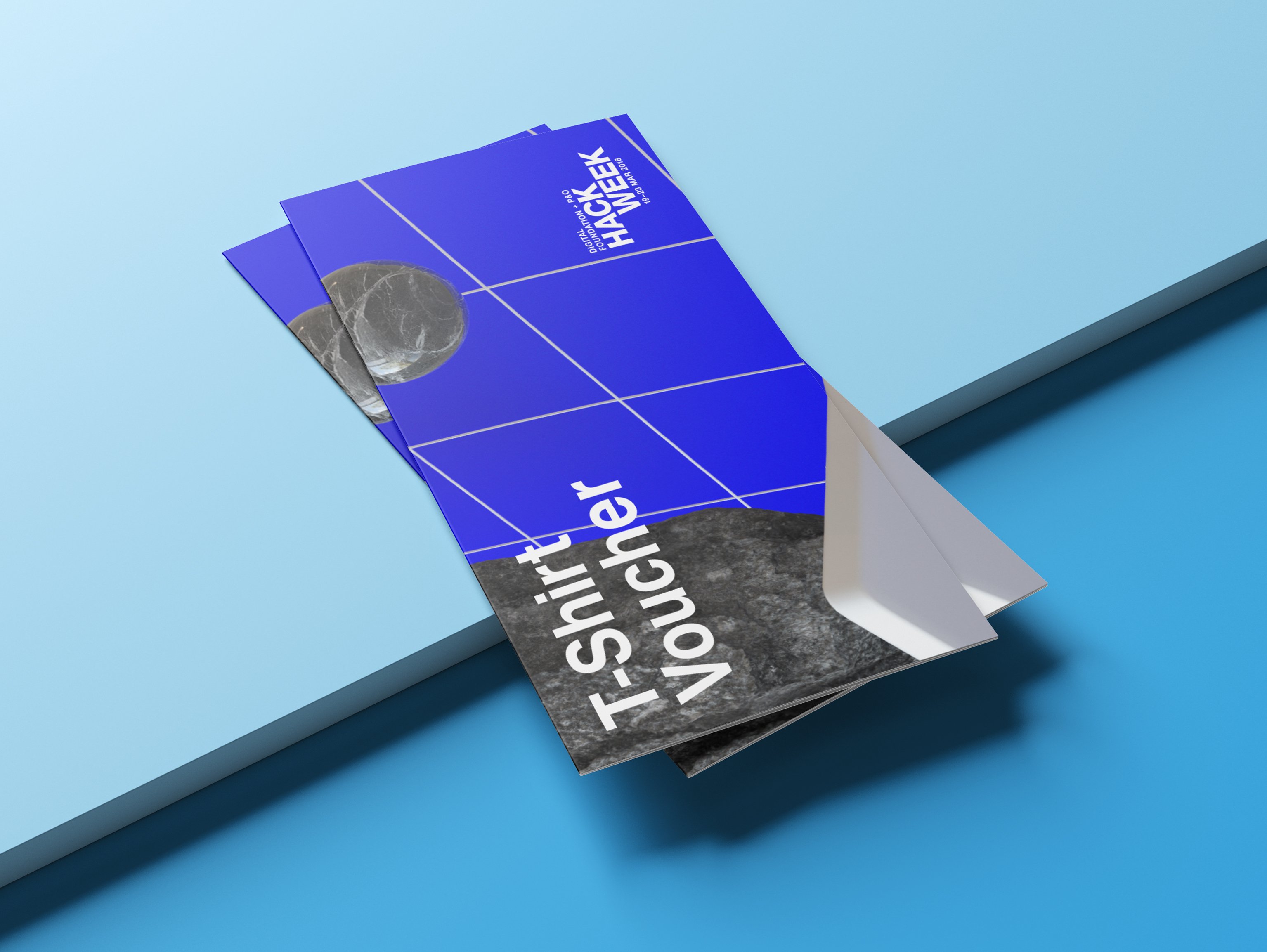
The total package included the design of event materials, posters, roll-ups, T-Shirts, stickers, postcards and various digital materials and posts.
Print.Branding.Web + Interface Design.Illustration
CLIENT
Zalando
3D Artist
Björn Fiekert